 |
|
Latest News:
OOTP 25 Available
- FHM 10 Available
- OOTP Go! Available
Out of the Park Baseball 25 Buy Now! |

|
|
||||
| ||||
 06-08-2012, 11:58 PM
|
#1 |
|
Hall Of Famer
Join Date: Dec 2001
Location: Phoenix, AZ
Posts: 3,137
|
Player profile screen / picture background
Has anyone figured out how to fix the background of the player picture so that the upper left corner (where the team logo happens to be) is not so dark?? Attached the background image I believe (got it from the skin files), but I can't make heads or tails of how to change this but still maintain the format.
__________________
GM - New Jersey Bears of the NPBL; |

|

|
|
06-09-2012, 06:35 AM
|
#4 | |
|
Hall Of Famer
Join Date: Apr 2004
Location: Dedham, MA
Posts: 9,746
|
Quote:
__________________
Senior "Nancy Boy" of the OOTP Boards _______________________________________________ |
|
|
|
|
|
06-09-2012, 07:19 AM
|
#5 |
|
Hall Of Famer
Join Date: Apr 2004
Location: Dedham, MA
Posts: 9,746
|
Figured it out:
Before: 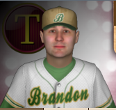 After: 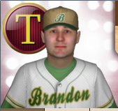 Big difference 
__________________
Senior "Nancy Boy" of the OOTP Boards _______________________________________________ |
|
|
|
|
06-09-2012, 07:42 AM
|
#6 |
|
Hall Of Famer
Join Date: Apr 2004
Location: Dedham, MA
Posts: 9,746
|
was able to change the whole background to solid. Not sure I'm a fan, but at least there are possibilities.
__________________
Senior "Nancy Boy" of the OOTP Boards _______________________________________________ |
|
|
|
|
06-09-2012, 11:11 AM
|
#7 | |
|
Hall Of Famer
Join Date: Dec 2001
Location: Phoenix, AZ
Posts: 3,137
|
Quote:
__________________
GM - New Jersey Bears of the NPBL; |
|
|
|
|
|
06-09-2012, 11:29 AM
|
#8 |
|
All Star Reserve
Join Date: Jul 2008
Posts: 832
|
Where are those unpacked skin files?
|

|
|
|
06-09-2012, 01:00 PM
|
#10 | |
|
Hall Of Famer
|
Quote:
__________________
5000+ Generic Logos Free for the Taking FREE: Uniforms and logos for 500+ teams spanning 1871-present Great Lakes League: 10 Conferences, 100 Teams Pre-OOTP 23 Custom Cap & Jersey Template v3.0 by Deft and NoPepper (with layers from other various artists) that I use: Caps, Jerseys |
|
|
|
|
|
06-09-2012, 03:57 PM
|
#11 |
|
Hall Of Famer
Join Date: Aug 2002
Posts: 16,843
|
Love the idea and encourage the tinkering with anything skin and graphic related to add to the game. I have mixed feelings on the brighter background, edging toward favoring it over the existing. The darker background does provide a bit more of a three dimensional look, actually becoming a background with the lighting, making the player appear closer. The logo is, without a doubt, more clearly presented with the lighter background, but it does lose a bit of the layered dimension, but much cleaner and crisper.
The team logo is usually present somewhere on a page, so I'm not sure why it's included in the player photo in v13's iteration. On a sidenote, I'm strongly advocating getting the player photo back into the profile IN-game. Good Lord, I miss that.  Oh, well. Oh, well.In any event, good work on locating and manipulating the background on this one. The spotlights are even brighter and seem more numerous in that rendition, making me favor it even more as I write. Thanks!
__________________
"Try again. Fail again. Fail better." -- Samuel Beckett _____________________________________________ |
|
|
|
|
06-24-2012, 06:41 PM
|
#12 | |
|
Hall Of Famer
Join Date: Dec 2001
Location: Union City, TN
Posts: 6,383
|
Quote:
Last edited by Cooleyvol; 06-24-2012 at 06:48 PM. |
|
|
|
|
|
06-24-2012, 09:40 PM
|
#13 | |
|
Hall Of Famer
Join Date: Dec 2001
Location: Troy, Mo
Posts: 6,251
|
Quote:
 and the file if you don't mind. and the file if you don't mind.
|
|
|
|
|
|
06-24-2012, 09:50 PM
|
#14 |
|
Hall Of Famer
Join Date: Dec 2001
Location: Union City, TN
Posts: 6,383
|
Here's the file and a screenshot of a young Johnny Podres.
I'll let you be the judge of its appeal. Last edited by Cooleyvol; 06-24-2012 at 09:58 PM. |
|
|
|
|
06-24-2012, 09:58 PM
|
#15 | |
|
Hall Of Famer
Join Date: Dec 2001
Location: Troy, Mo
Posts: 6,251
|
Quote:

Last edited by MizzouRah; 06-24-2012 at 11:19 PM. |
|
|
|
|
|
06-25-2012, 10:30 AM
|
#16 | |
|
Hall Of Famer
Join Date: Dec 2001
Location: Troy, Mo
Posts: 6,251
|
Quote:
|
|
|
|
|
|
06-25-2012, 06:04 PM
|
#18 |
|
Minors (Rookie Ball)
Join Date: Jun 2012
Posts: 29
|
Where do you replace the file?
|
|
|
|
|
06-25-2012, 08:21 PM
|
#19 | |
|
Minors (Triple A)
Join Date: May 2012
Posts: 223
|
Quote:
I actually prefer the dark, but agree the 50 percent transparency is better than no shadow. I think the point of the dark screen over the logo is to let you see that logo enough to know the club for which he plays, but leaves the true brightness for the player's face -- like he's in the spotlight.
|
|
|
|
|
|
06-26-2012, 09:14 AM
|
#20 | |
|
Minors (Triple A)
Join Date: Jun 2009
Location: SE Indiana
Posts: 268
|
Quote:
__________________
All of my 2013 Drop Shadow Logos located here |
|
|
|
|
 |
| Bookmarks |
|
|


