 |
|
Latest News:
OOTP 25 Available
- FHM 10 Available
- OOTP Go! Available
Out of the Park Baseball 25 Buy Now! |

|
|
||||
| ||||
 12-29-2012, 04:50 AM
|
#1 |
|
Major Leagues
|
Various Logos
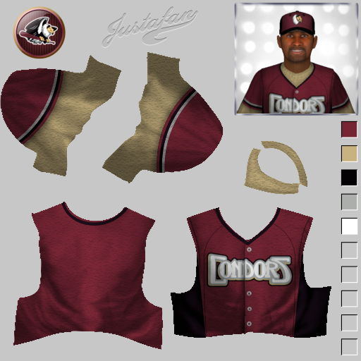
I have a decent number of logos that I intended for use in a baseball league (and, who knows, perhaps I will form that league some day). Many of these logos are ones that I adjusted from existing logos: I take a raster image, vectorize it, and then adjust it to suit my purposes.
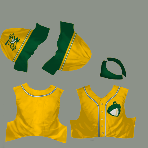
In any case, I thought that I'd share some of these with everybody. I want to give each of them one last "spit & polish" before I post to the boards, so I'll be releasing them slowly. The first one is a baseball adaptation of the Bakersfield Condors, a minor league hockey team. |

|

|
|
12-31-2012, 03:53 AM
|
#2 |
|
Major Leagues
|
I love old minor league baseball nicknames. In 1906 the Fresno Raisin Eaters had one forgettable season. According to Wikipedia, in 2006 the Fresno Grizzlies payed tribute to the old nickname by wearing "Raisin Eaters" jerseys on Wednesday games.
Also at Wikipedia, you can see the old-fashioned logo that they designed in 2006 (make sure to click on the image to see a larger version). You will notice that I have isolated the logo from the surrounding text and changed the coloration. Where theirs was a pale yellow and faded red, mine adopts Raisin Bran colors: yellow and purple. This is one of my favorite logos. It just makes me happy.  |
|
|
|
|
12-31-2012, 09:07 AM
|
#3 |
|
Hall Of Famer
Join Date: Dec 2008
Location: "Deep in the Heart Of"
Posts: 8,202
|
Nice work on the logos... Love
 the Raisin Eaters logo the Raisin Eaters logo ... Thanks for sharing your amazing work here with us... Now I have no choice but to add the Raisin Eaters to one of my leagues... ... Thanks for sharing your amazing work here with us... Now I have no choice but to add the Raisin Eaters to one of my leagues...
__________________
 Last edited by txranger; 12-31-2012 at 07:08 PM. |
|
|
|
|
01-01-2013, 02:48 AM
|
#4 |
|
Major Leagues
|
Thanks, txranger! I've certainly been enjoy the work that you and knuckler have been doing in the retro thread.
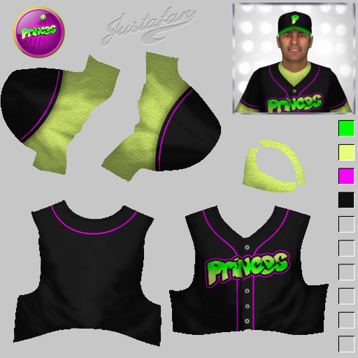
Two more logos this evening. One is for the Bel Air Princes�a purely fictional invention, of course. I forgot where I found the lettering, but I turned it into a Dodgers-like logo. Fun times. The other comes from the Canton Crocodiles, a late-90's team that played in the independent Frontier League. They moved to Washington, Pennsylvania and became the Washington Wild Things. You may have noticed by now that I like to remove the logo from the background lettering. Why? In part, personal preference; in part, it permits the logo to be used by teams in other cities. |
|
|
|
|
01-05-2013, 03:17 AM
|
#5 |
|
Major Leagues
|
First off, txranger created a beautiful Fresno Raisin Eater uniform (plus a bonus retro logo!) in the retro logo thread here. Nice job, mate!
Here are two more random logos. I've seen both of these logos on OOTP, but I have not seen them isolated from background text. The first comes from another Frontier League team, the Traverse City Beach Bums. My source on the logo is sportslogo.net. The second is the Reno Silver Sox. There was a California League team by this name back in the day: the 1961 team was particularly good, going 97-43. This logo comes (if I have my facts right) from the Golden League Baseball team of 2006-2008, which, in turn became the Saskatchewan Silver Sox. Last edited by omniart; 01-05-2013 at 03:25 AM. |
|
|
|
|
01-06-2013, 04:08 AM
|
#6 |
|
Major Leagues
|
Here's an obscure one: the Clyman Canners. From Clyman, Wisconsin, they play in the Rock River Baseball League, an adult amateur league in Southern Wisconsin. Their home page tells me that they won the Rock River League four times in the previous decade. Well done, Canners!
Their logo is just great. It's a tin can swinging a bat, wearing a square cap, and sporting a moustache! If there's a secret formula to a great baseball logo it's something + swinging bat + square cap + moustache. |
|
|
|
|
02-01-2013, 04:11 AM
|
#7 |
|
Major Leagues
|
The first of these logos belongs to the Tucson Toros, a Triple-A team from 1969 to 1997. They had some of the most incredible uniforms in the history of all baseball, witness this. The best Toros logo that I could find on the web was the 122x122 png file over at Wikipedia. OOTP logos are, of course, 150x150, so that logo, when stretched, looks slightly pixellated.
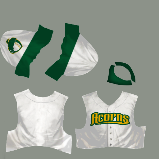
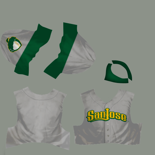
I hate pixellation. This logo is my best attempt at recreating that logo: I traced that raster image in a vector art program (Inkscape). I think that it turned out rather well, but I want to emphasize that this is my adaption, not a 100% accurate logo. I'm not an artist; I'm a stubborn guy who really hates pixellation. The second logo comes from this interesting website, which roots for the Oakland A's to move to San Jose. The squirrel represents the fictional San Jose Acorns, and, boy, that squirrel is one amazing baseball logo. The sharp lines in the batting stance, the oak leaf hanging from the bat, the acorn on the shirt sleeve�it's just perfect. |
|
|
|
|
02-01-2013, 10:15 AM
|
#8 |
|
All Star Starter
Join Date: Jan 2003
Location: Milwaukee, WI
Posts: 1,553
|
Couldn't resist...
__________________
Uniforms compatible with OOTP23/24 Historical Major League Baseball 1901-current Historical Major League Baseball 1871-1900 Historical Federal League Historical Negro Leagues |
|
|
|
|
02-01-2013, 05:00 PM
|
#9 |
|
Major Leagues
|
Nice job, NoPepper! I love that you made home, road, and alternate versions of the uniform. Thanks!
__________________
Graphics on Google Drive Commissioner, Great Lakes Baseball League San Diego Padres, PCL Redux Cincinnati Packers, American Circuit Athletic Bilbao, UEBA |
|
|
|
|
02-02-2013, 01:47 PM
|
#10 |
|
Hall Of Famer
Join Date: Feb 2002
Location: S. Carolina
Posts: 5,297
|
I wanna play too...
__________________
  
|
|
|
|
|
02-02-2013, 03:19 PM
|
#11 |
|
Hall Of Famer
Join Date: Oct 2010
Location: Former Southie
Posts: 2,068
|
Sheesh, Justafan ... I love your signature within your fantastic Uni's ... breathtaking, mate!!

__________________
Always a pleasure to stop in and visit the neighborhood!!
|
|
|
|
|
02-02-2013, 03:55 PM
|
#12 |
|
Major Leagues
|
Nice uniforms, Justafan! I particularly like the coloration you do around the air holes in the caps. That's a nice touch that I neither noticed nor even considered before.
__________________
Graphics on Google Drive Commissioner, Great Lakes Baseball League San Diego Padres, PCL Redux Cincinnati Packers, American Circuit Athletic Bilbao, UEBA |
|
|
|
|
02-06-2013, 06:06 AM
|
#13 |
|
Major Leagues
|
The old Albuquerque Dukes logo wouldn't seem to be uncommon, but those that I have found either are smaller than 150x150 or have a fabric texture. So I worked on a sharper logo.
The Mesa Solar Sox are a team in the Arizona Fall League. Their logo can be seen on their official home page here. It shows a flaming, setting sun on a black background. I liked the design (and it looks really nice on a baseball cap), but wanted to see what it looked like if the sun was not setting but full. I have mixed feelings on the result: the logo works great on a black background (the black outlines don't really do it justice), and it reminds me more of a starfish than a sun. Maybe I'll go back and leave the sun setting ... The logo for the Northwest Baseball League is an adaptation of a soccer logo belonging to the Northwest Champions League, a youth soccer league in Washington and Oregon for the U12 to U18 premier team. It's a much better logo, I think, than the lame logo used by the actual class-A Northwest League. |
|
|
|
|
02-16-2013, 06:27 PM
|
#14 |
|
Hall Of Famer
Join Date: Feb 2002
Location: S. Carolina
Posts: 5,297
|
Canton Crocodiles
__________________
Last edited by justafan; 02-16-2013 at 06:37 PM. |
|
|
|
|
02-16-2013, 06:28 PM
|
#15 |
|
Hall Of Famer
Join Date: Feb 2002
Location: S. Carolina
Posts: 5,297
|
Clyman Canners
__________________
Last edited by justafan; 02-16-2013 at 06:38 PM. |
|
|
|
|
02-17-2013, 10:03 AM
|
#16 |
|
Minors (Triple A)
Join Date: Apr 2006
Posts: 229
|
PITTSBURG hIGH pIRATES
|
|
|
|
|
02-17-2013, 11:09 AM
|
#17 | |
|
Major Leagues
|
Quote:
__________________
Graphics on Google Drive Commissioner, Great Lakes Baseball League San Diego Padres, PCL Redux Cincinnati Packers, American Circuit Athletic Bilbao, UEBA |
|
|
|
|
|
02-17-2013, 06:24 PM
|
#18 |
|
Minors (Triple A)
Join Date: Apr 2006
Posts: 229
|
was not my intention...sorry
|
|
|
|
|
03-29-2013, 09:17 PM
|
#19 |
|
Major Leagues
|
This Edmonton Trapper logo is another favorite of mine. You don't see too many logos with a ballplayer in a catcher's crouch, but this logo would suggest that there should be more of them. I love the glove at the center, I love the snowshoes, and I love his jolly grin.
The only version of this logo that I could find, here, was a 100x100 jpg. This version is my best attempt at tracing it. |
|
|
|
|
04-06-2013, 03:56 AM
|
#20 |
|
Major Leagues
|
The Lethbridge Black Diamonds are a former minor league team. They were located in Lethbridge, Alberta, back when there were minor league teams in Canada. I managed to trace the logo; in the process, I removed the "L".
The Casper Ghosts are another former minor league team. This past offseason they moved to Grand Junction and are now known as the Rockies. The actual Casper Ghosts logo is rather interesting, with it's dotted appearance. The hats are really cool as the logo glows in the dark. The logo that I have here comes from a completely separate source, going back to the original Casper the Friendly Ghost comics, specifically issue #144. The Fort Collins Foxes are a team in the Mountain Collegiate Baseball League, an independent summer wood bat league. It's another logo that I liked but could only find in a pixellated version, leaving me to trace it. The last logos come from the Baton Rouge River Bats. They were a team in the defunct Southeastern League, an independent league back in 2002-03. However, I like to use the nickname Baton Rouge Red Sticks (which is what Baton Rouge means in French): this was a team back in the 40's and 50's. The last logo (with the red baseball bat) is the one I use for the Red Sticks. |
|
|
|
 |
| Bookmarks |
|
|


