|
|
Latest News:
OOTP 25 Available
- FHM 10 Available
- OOTP Go! Available
Out of the Park Baseball 25 Buy Now! |

|
|
||||
| ||||
 05-29-2015, 03:33 AM
|
#1 |
|
Hall Of Famer
Join Date: Aug 2011
Location: Tampa Bay, Massachusetts
Posts: 2,928
|
Fyre's Future MLB Set
ZIP FILE: MLB Redesign
Well, with my recent hard drive crash, I've had to re-create both my template and a few of my more recent jerseys, so I figured now's a good a time as any to update my entire league. No reason not to post them here while I'm at it. These are heavily based off of Gern's Re-Imagined MLB Jerseys, so a lot of credit goes to him. Note: Each set will contain a main logo, alt logo, home jersey, away jersey, and cap. They'll be updated whenever I get them done. In my universe, these jerseys came into play in 2016, as part of a league-wide re-design. Any team that has changed their look since 2016 will therefore have multiple sets. It's now 2021, though, and many teams have updated their logo and/or color scheme in the decade that the league's been running. Three teams (the Indians, Padres, and Orioles) have re-branded altogether. For those three, I'll post both their fictional design and a current-day one, so if anyone wants to use these as an MLB set, they won't be missing teams. But any other logo/color changes will stay as they are; this is my league after all; I'm just sharing.  I'll be going in reverse alphabetical order, because my naming convention starts with the team name, and it's nice to have the pictures I just made always sitting at the top of the list. Last edited by Fyrestorm3; 07-23-2015 at 11:07 PM. |

|

|
|
05-29-2015, 03:35 AM
|
#2 |
|
Hall Of Famer
Join Date: Aug 2011
Location: Tampa Bay, Massachusetts
Posts: 2,928
|
New York Yankees
The Yanks' classic uniforms made a pretty easy transition into the new style. A reversed color scheme on their home jersey and the addition of pinstripes on their away were really the only changes that needed to be made, and I doubt I'll touch these for years to come. 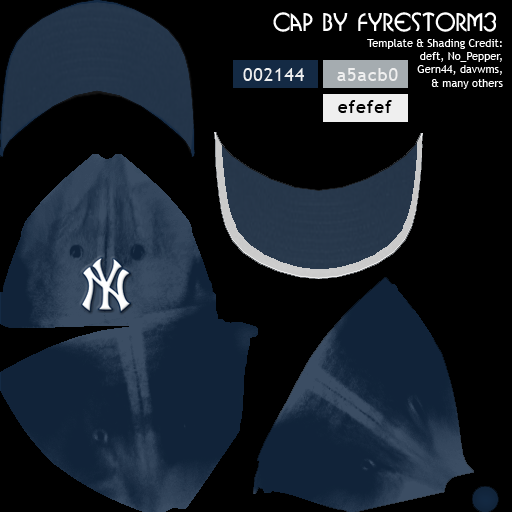 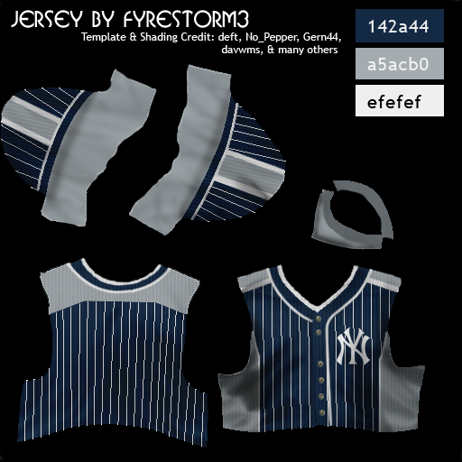 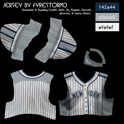
Last edited by Fyrestorm3; 06-05-2015 at 10:04 PM. |
|
|
|
|
05-29-2015, 03:56 AM
|
#3 |
|
Hall Of Famer
Join Date: Aug 2011
Location: Tampa Bay, Massachusetts
Posts: 2,928
|
Chicago White Sox
Another recognizable look that didn't require many changes - at first. The only thing missing was a main logo, as I really don't like the over-simplified sock silhouette. So I updated the logo to include the team's classic "Sox" script on top of the diamond. The ChiSox later switched from a black home jersey to a gray one, and switched the away paneling from gray to black, primarily due to my realization that their original uniforms looked strikingly similar to the Yankees'. 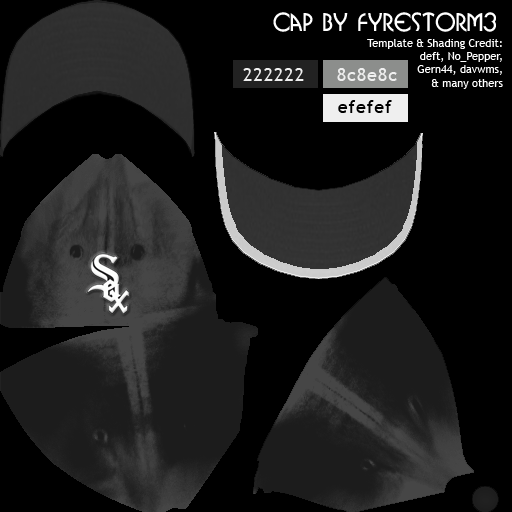 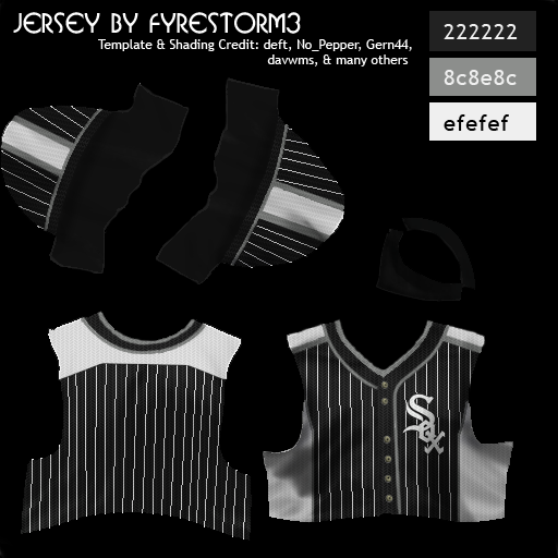 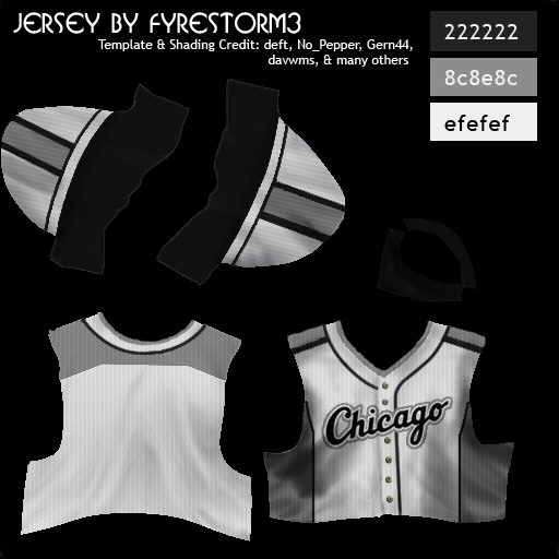 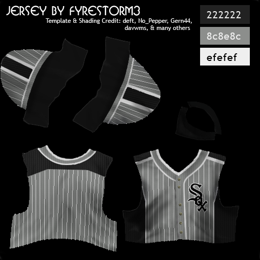 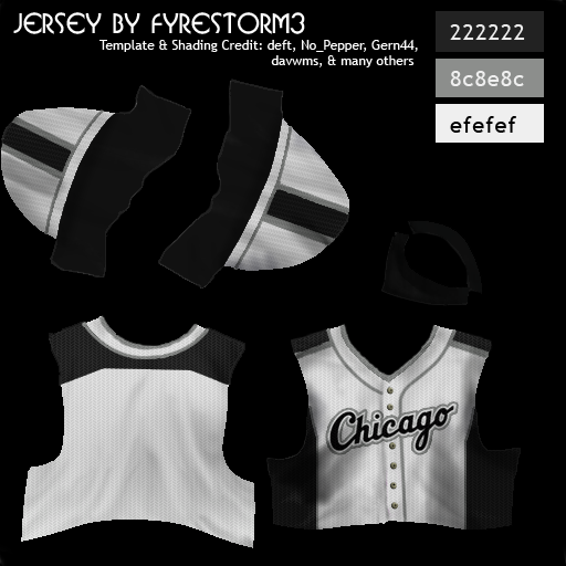
Last edited by Fyrestorm3; 06-05-2015 at 10:06 PM. |
|
|
|
|
05-29-2015, 02:10 PM
|
#4 |
|
Hall Of Famer
Join Date: Aug 2011
Location: Tampa Bay, Massachusetts
Posts: 2,928
|
Minnesota Twins
The Twins initially tried to move away from their "TC" logo, but due to popular demand, brought it back on their caps a few years later. Silver was also incorporated into the home uniform. 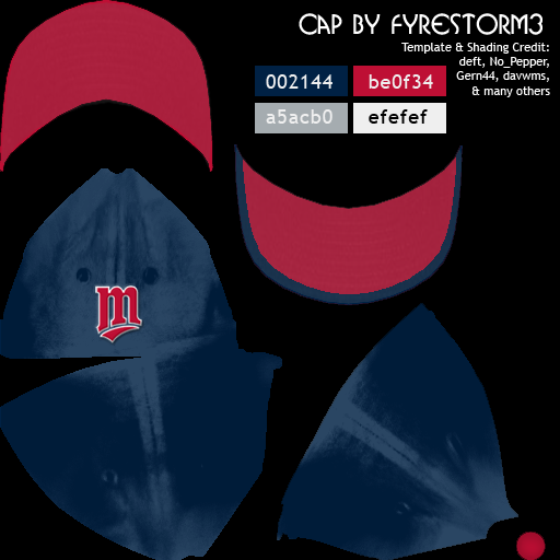  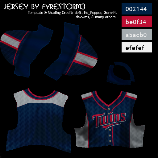 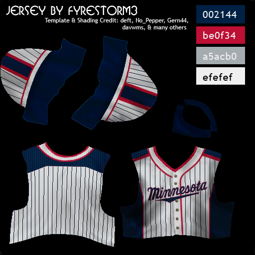
Last edited by Fyrestorm3; 06-05-2015 at 10:08 PM. |
|
|
|
|
06-01-2015, 10:26 AM
|
#5 |
|
All Star Starter
|
Those look great Fyre.
I wish my template was nearly as organized as yours. 
Last edited by Gern44; 06-01-2015 at 10:30 AM. |
|
|
|
|
06-01-2015, 12:06 PM
|
#6 | |
|
Hall Of Famer
Join Date: Aug 2011
Location: Tampa Bay, Massachusetts
Posts: 2,928
|
Quote:
But seriously, your original design was awesome and inspired me to do the whole side- and shoulder-panel thing.I'll be getting to the rest of the set soon; got caught up doing the NBA D-League unis for Jay. |
|
|
|
|
|
06-01-2015, 09:57 PM
|
#7 |
|
Hall Of Famer
Join Date: Feb 2012
Location: Inside The Game
Posts: 30,803
|
Pretty cool Fyre. I will use these at some point. Right now most of my MLB teams are using Pwal's David Miller uniforms (With the exception of the White Sox, how could you David Miller?). After that I probably will switch to these around 2035. When these are done I would like to get a zip if possible.
__________________
Go today don't wait for tomorrow It isn't promised, all the time you get borrowed Don't live your life for other people Don't bottle your emotions till they crack and fill a couple just sorrows Take your mind and refocus go get a paper write your goals out Throw your middle fingers to all your haters "Stay Strong" 
|
|
|
|
|
06-02-2015, 12:16 AM
|
#8 | |
|
Hall Of Famer
Join Date: Aug 2011
Location: Tampa Bay, Massachusetts
Posts: 2,928
|
Quote:
|
|
|
|
|
|
06-05-2015, 10:14 PM
|
#9 |
|
Hall Of Famer
Join Date: Aug 2011
Location: Tampa Bay, Massachusetts
Posts: 2,928
|
Gettin' right back into it...
Detroit Tigers Someone explain to me how the TIGERS don't wear any orange? Yeah, we're fixing that. Other than the color change, this was a fairly standard update. 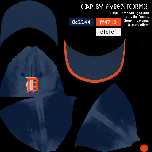 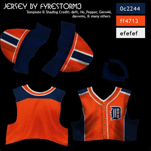 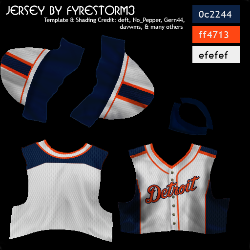
|
|
|
|
|
06-06-2015, 06:01 AM
|
#10 | |
|
Hall Of Famer
Join Date: Feb 2012
Location: Inside The Game
Posts: 30,803
|
Quote:
__________________
Go today don't wait for tomorrow It isn't promised, all the time you get borrowed Don't live your life for other people Don't bottle your emotions till they crack and fill a couple just sorrows Take your mind and refocus go get a paper write your goals out Throw your middle fingers to all your haters "Stay Strong"
|
|
|
|
|
|
06-06-2015, 10:29 PM
|
#11 | |
|
Hall Of Famer
Join Date: Aug 2011
Location: Tampa Bay, Massachusetts
Posts: 2,928
|
Quote:
|
|
|
|
|
|
06-11-2015, 06:57 PM
|
#12 |
|
Hall Of Famer
Join Date: Aug 2011
Location: Tampa Bay, Massachusetts
Posts: 2,928
|
Cleveland Spiders
Yep, in 2015 (weird how that was far in the future at the time), the Indians finally caved to the politically correct pressure and moved away from their long-standing nickname, opting to bring back the old Cleveland Spiders. The "Cleveland" wordmark remains unchanged, save for the new color scheme, while the rest of the design, logos and all, got a major overhaul. Note: While this is entirely custom work, the stylized spider in the main logo was found via a Google search, so chances are it's copyrighted. Just an fyi. 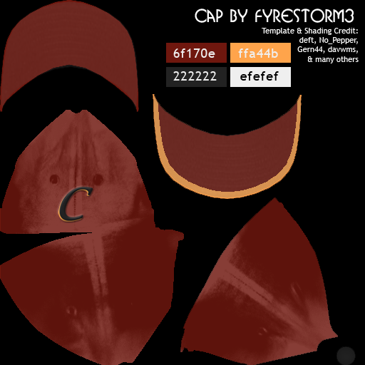 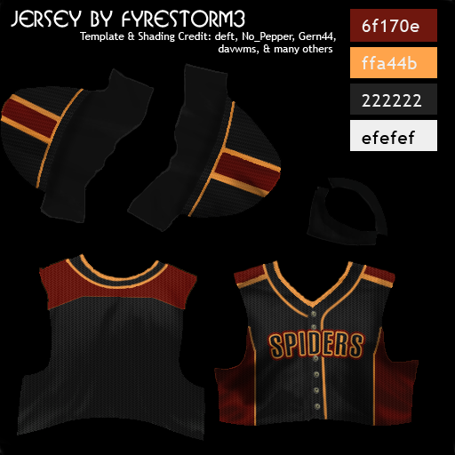 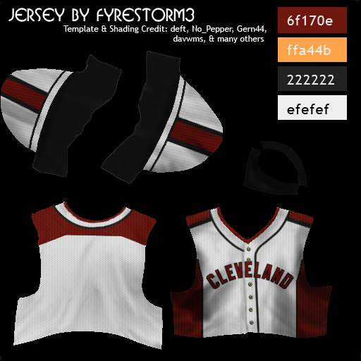 An Indians design will be coming in a minute. Last edited by Fyrestorm3; 07-09-2015 at 10:13 PM. |
|
|
|
|
06-11-2015, 07:00 PM
|
#13 |
|
Hall Of Famer
Join Date: Aug 2011
Location: Tampa Bay, Massachusetts
Posts: 2,928
|
Cleveland Indians
The color scheme got reversed on the home jersey, because I've always felt like the Indians were more of a red team than a blue one. Plus, in a division with Minnesota, Detroit, and Kansas City, some variation felt necessary. I also did up two hats, one with Chief Wahoo and one without. 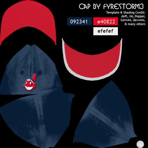  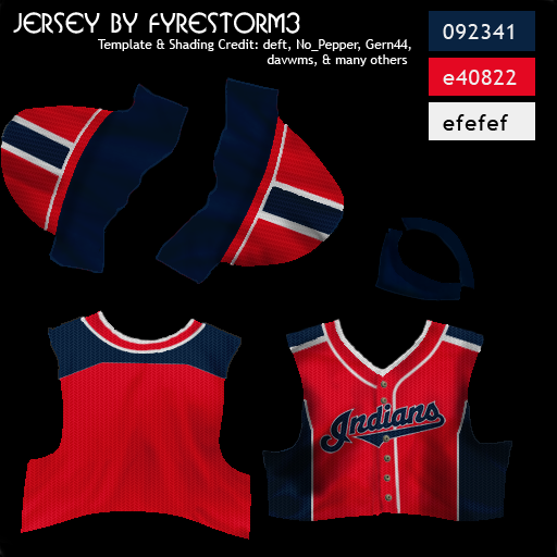 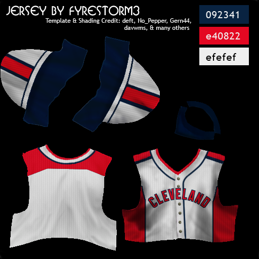
|
|
|
|
|
06-12-2015, 12:26 AM
|
#14 |
|
Hall Of Famer
Join Date: Aug 2011
Location: Tampa Bay, Massachusetts
Posts: 2,928
|
Kansas City Royals
The Royals made a pretty simple transition into their new uniforms. Opting to go with their powder blue jerseys as their main, they also lightened the royal blue a few shades to match. 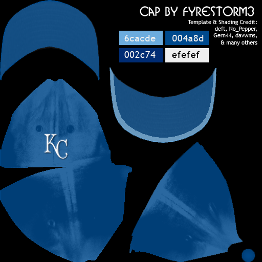 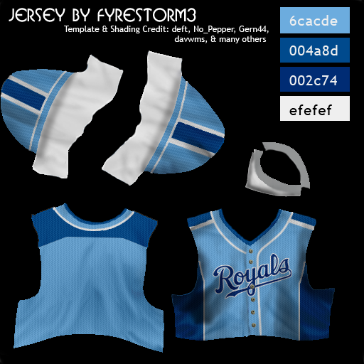 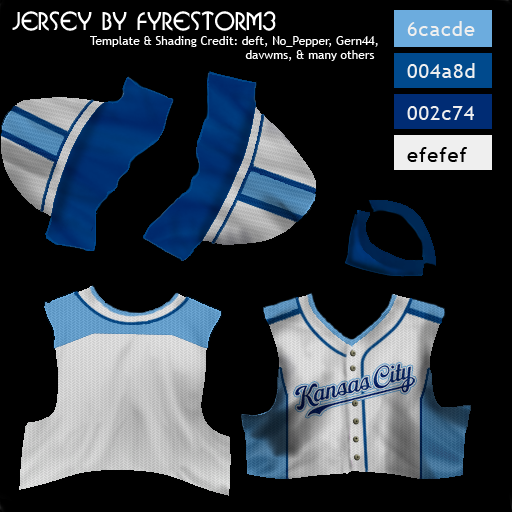
|
|
|
|
|
06-12-2015, 01:02 AM
|
#15 |
|
Hall Of Famer
Join Date: Jul 2004
Location: The big smoke
Posts: 15,628
|
I'm looking to refresh a long running fictional mlb. These uniforms look great for that purpose. Thanks
__________________
Cheers RichW If you�re looking for a good cause to donate money to please consider a Donation to Parkinson�s Canada. It may help me have a better future and if not me, someone else. Thanks. �Conservatism consists of exactly one proposition �There must be in-groups whom the law protects but does not bind, alongside out-groups whom the law binds but does not protect.� Frank Wilhoit |
|
|
|
|
06-12-2015, 03:44 AM
|
#16 |
|
Hall Of Famer
Join Date: Feb 2012
Location: Inside The Game
Posts: 30,803
|
Glad you made Cleveland Spiders as I use them in 2 leagues and the MLB Indians will change their name soon in my EBL vs MLB league.
__________________
Go today don't wait for tomorrow It isn't promised, all the time you get borrowed Don't live your life for other people Don't bottle your emotions till they crack and fill a couple just sorrows Take your mind and refocus go get a paper write your goals out Throw your middle fingers to all your haters "Stay Strong"
|
|
|
|
|
06-12-2015, 02:33 PM
|
#17 |
|
Hall Of Famer
Join Date: Aug 2011
Location: Tampa Bay, Massachusetts
Posts: 2,928
|
Colorado Rockies
The Rockies donned a slightly modified logo on their home unis: their traditional "Rockies" text, overlayed against a modified version of the mountains in their main logo. Otherwise, no real major changes here. 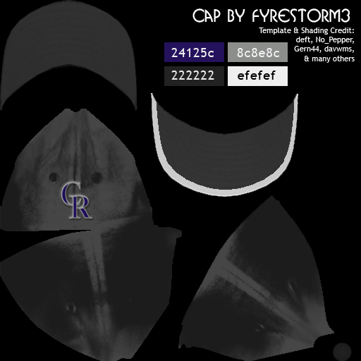 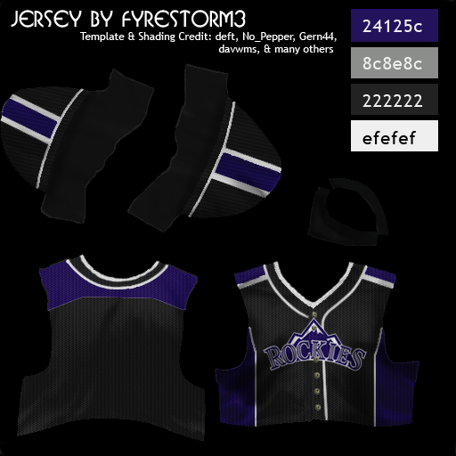 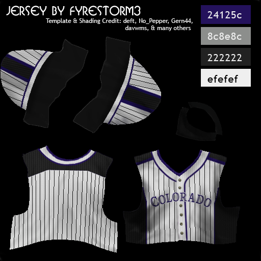
|
|
|
|
|
06-13-2015, 10:30 AM
|
#18 |
|
Minors (Triple A)
Join Date: May 2007
Location: Mockingbird Heights
Posts: 299
|
Man, these are truly awesome! I'm loving every one of them so far. I usually play entirely fictional, but even when I go MLB, I usually go wild with the fiction, so these are just the thing. Can't wait to see the Cubs when you get around to that one. Any chance of the Brooklyn Dodgers making the list? I have a tendency to keep them in my games, (sometimes I even send the Mets to Los Angeles as the Metros).

__________________
My beloved, Scooby Doo-looking German Shepherd, Rocky Thanksgiving Day, 1998 - October 28, 2011 |
|
|
|
|
06-13-2015, 10:37 AM
|
#19 |
|
Hall Of Famer
Join Date: Dec 2008
Location: "Deep in the Heart Of"
Posts: 8,202
|
Nice work on all of these... I will second that notion on doing the Brooklyn Dodgers... It just ain't the same without "dem bums" !!!
__________________
 |
|
|
|
|
06-13-2015, 11:46 AM
|
#20 | |
|
Hall Of Famer
Join Date: Aug 2011
Location: Tampa Bay, Massachusetts
Posts: 2,928
|
Quote:
|
|
|
|
|
 |
| Bookmarks |
| Thread Tools | |
|
|