 |
|
Latest News:
OOTP 25 Available
- FHM 10 Available
- OOTP Go! Available
Out of the Park Baseball 25 Buy Now! |

|
|
||||
| ||||
 05-29-2016, 03:07 PM
|
#1 |
|
Minors (Double A)
Join Date: Dec 2015
Posts: 143
|
MLB c.2020s
Love 'em or hate 'em, I figure the new Diamondbacks uniforms are the wave of the future in MLB uniform design. I also expect teams to start migrating toward heavier use of color tops, especially as a way to distinguish their appearance at home. In that spirit, I've been making a few unis for teams to give them a near-future look.
First up: the St. Louis Cardinals. The Redbirds have, in this envisioning, embraced yellow more as a secondary color. Controversially, they have also relegated their cartoon bird to a tertiary role, adopting more conventional wordmarks. Here they are, the Cardinals circa 2027: Home:   Away:   Next up: the Cardinals' division rivals, the Cincinnati Reds. |

|

|
|
05-29-2016, 03:40 PM
|
#2 |
|
Major Leagues
Join Date: Mar 2007
Location: Alabama
Posts: 489
|
Looks good. Can not wait to see others.
|
|
|
|
|
05-29-2016, 04:30 PM
|
#3 |
|
Minors (Double A)
Join Date: Dec 2015
Posts: 143
|
The Cincinnati Reds moved to a more colorful style earlier than other teams. They ditched the pink-red primary color in favor of two tones affectionately known as "red" and "redder". They also tried to start a trend that hasn't really caught on with their grey away caps, but it does make them distinctive on the road.
Here they are, the Reds circa 2020: Home:  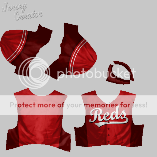 Away:  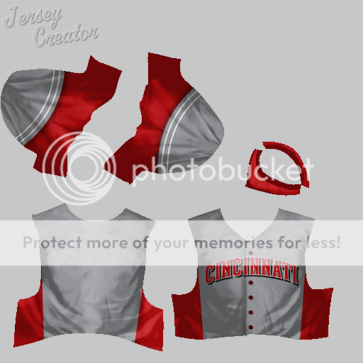 Next up: we'll hop over to the American League with the Detroit Tigers. |
|
|
|
|
05-31-2016, 11:45 AM
|
#4 |
|
Minors (Double A)
Join Date: Dec 2015
Posts: 143
|
The Detroit Tigers have decided to incorporate more orange into their look. They have also played around with their uniform design, ultimately going for a stripey look in keeping with their name. Not all the fans like the direction they've gone in, but they're very recognizable.
Here they are, the Detroit Tigers circa 2026: Home:   Away:   Next up, the Tigers' division rivals, the Kansas City Royals. |
|
|
|
|
06-01-2016, 08:35 PM
|
#5 |
|
Minors (Double A)
Join Date: Dec 2015
Posts: 143
|
Apparently someone in the Kansas City Royals' front office decided the world of baseball wasn't paying enough attention to them. Looking to distinguish itself from other teams that heavily used blue and white in their color scheme, the Royals boosted the presence of gold and dropped "royal blue" for an eye-popping shade of ultramarine. No one can mistake the Royals for anyone else anymore.
Here they are, the Kansas City Royals circa 2029: Home:   Away:  Next, we head north of the border for a look at the Toronto Blue Jays. |
|
|
|
|
06-01-2016, 11:34 PM
|
#6 |
|
Banned
Join Date: Dec 2012
Location: South Carolina
Posts: 1,441
Infractions: 0/4 (4)
|
Freakin awesome!! I will be using these for something in my league
|
|
|
|
|
06-03-2016, 03:49 PM
|
#7 |
|
Minors (Double A)
Join Date: Dec 2015
Posts: 143
|
The Toronto Blue Jays have a distinctive style, and by gum, they like it. The team is emphasizing their shades of dark and light blue a little more these days, along with their red and white Canadian flag-colored accents, but they haven't radically overhauled their look the way some teams have.
Here they are, the Toronto Blue Jays circa 2026: Home:   Away:   Next up, the other bird-themed AL East team, the Baltimore Orioles. |
|
|
|
|
06-03-2016, 08:18 PM
|
#8 |
|
Hall Of Famer
Join Date: Nov 2002
Location: Ohio
Posts: 2,420
|
Those are very nice!
__________________
Cultural icons, gone but not forgotten: David Bowie, Lou Reed, William S. Burroughs, Tristan Tzara, Jack Kerouac, Allen Ginsburg, Jimi Hendrix, John Cage, Johnny Thunders (New York Dolls), Mike Hudson (The Pagans), Joey Ramone (Ramones), Stiv Bators (Dead Boys), Tomata Du Plenty (The Screamers), Joe Strummer (The Clash), Lester Bangs |
|
|
|
|
06-04-2016, 02:39 PM
|
#9 |
|
Minors (Double A)
Join Date: Dec 2015
Posts: 143
|
At long last, the Baltimore Orioles decided to ditch that smirking cartoon bird and their spring training-style three-colored caps. Their color palette has stayed largely the same, with heavy use of orange, dark grey, and white tones befitting an oriole. Their little-used "O's" logo has become much more prominent.
(And I'd be remiss not to note the source of their arm patches on these jerseys: they're the work of bohob at SportsLogos.net: http://boards.sportslogos.net/topic/...oject/?page=11) Here they are, the Baltimore Orioles circa 2025: Home:  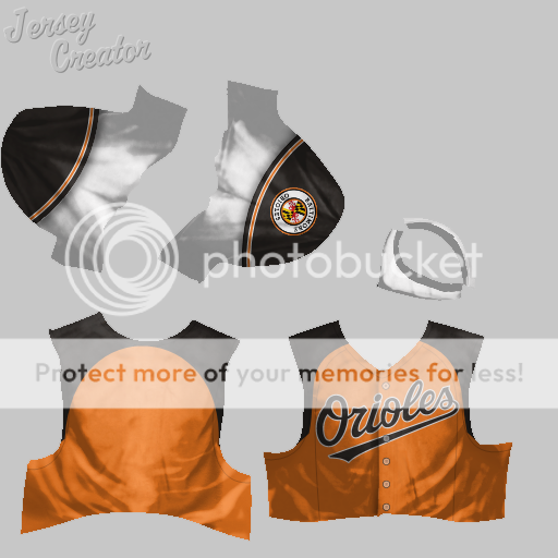 Away:  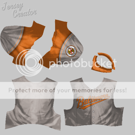 And here's a freebie for those of you who, for some reason, like the white-fronted caps and helmets the Orioles currently use:  Next up, the Orioles' regional rivals, the Washington Nationals! Last edited by SaoMagnifico; 06-04-2016 at 02:42 PM. |
|
|
|
|
06-04-2016, 02:52 PM
|
#10 | |
|
Banned
Join Date: Dec 2012
Location: South Carolina
Posts: 1,441
Infractions: 0/4 (4)
|
Quote:
|
|
|
|
|
|
06-05-2016, 12:59 PM
|
#11 |
|
Minors (Double A)
Join Date: Dec 2015
Posts: 143
|
The Washington Nationals have a style they like, and they've largely stuck with it. Despite having a nice-looking wordmark, the team prefers the Yankees approach of having home jerseys bearing their "curly W" logo on the chest rather than the team name. These days, they're also rocking a pauldroned look for their jersey shoulders.
Here they are, the Washington Nationals circa 2026: Home:   Away:  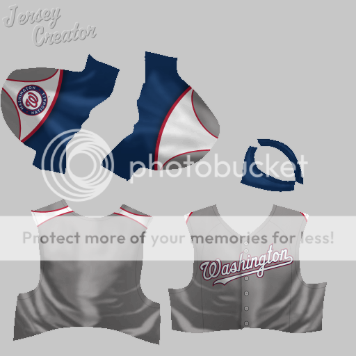 And a bonus for those of you who prefer the wordmarked look:  We'll travel to New York next for a look at the Nationals' division rivals, the Mets. |
|
|
|
|
06-08-2016, 11:12 AM
|
#12 |
|
Minors (Double A)
Join Date: Dec 2015
Posts: 143
|
The New York Mets are still working hard to get out from under the Yankees' shadow and establish themselves as a perennially contending, big-market team in their own right. It's a small thing, but it was important to them to migrate away from their Yankees-esque pinstripes and further embrace their blue, orange, and white color scheme. Their jerseys haven't changed much from what they wear now.
Here they are, the New York Mets circa 2026: Home:   Away:   And here's a bonus cap for those of you who, like me, wanted to see how the three-color scheme would translate to Mets headwear:  We'll take a look at how the Yankees' uniforms have changed (spoiler alert: very little) next. |
|
|
|
|
06-10-2016, 02:55 PM
|
#13 |
|
Minors (Double A)
Join Date: Dec 2015
Posts: 143
|
Baseball changes, but the New York Yankees stay the same. A perennial contender for virtually their entire franchise history, the Bronx Bombers are stubborn traditionalists when it comes to their uniforms. All they've done is go to a bit more modern of a look, while carrying over their famous pinstriped motif into their road uniforms.
Here they are, the New York Yankees circa 2019: Home:   Away:  And a bonus for wordmark jersey fans:  We're continuing our roadtrip up the East Coast next with a look in at the Boston Red Sox... |
|
|
|
|
06-14-2016, 01:28 AM
|
#14 |
|
Minors (Double A)
Join Date: Dec 2015
Posts: 143
|
The Boston Red Sox haven't gone too crazy. They've mostly just embraced their red color a bit more. Their style hasn't changed, preserving the iconic Yankees-Red Sox contrast (and even enhancing it with their red jerseys).
Here they are, the Boston Red Sox circa 2024: Home:  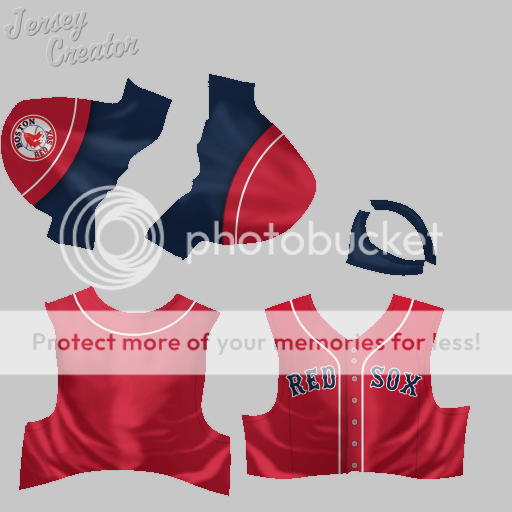 Away:  Next up, the other Sox: the Chicago White Sox. |
|
|
|
|
06-15-2016, 11:23 AM
|
#15 |
|
Minors (Double A)
Join Date: Dec 2015
Posts: 143
|
The Chicago White Sox are tough, because in terms of their uniform and logo design, they've been historically both innovative and nostalgic. Just look at their dugout walls, which are adorned with past and current logos alike. So in the early 2020s, the White Sox decided to adopt a totally radical new look while honoring different parts of their lineage.
(Credit for the sleeve patch goes to David Miller on the SportsLogos.net boards.) Here they are, the Chicago White Sox circa 2021: Home:   Away:  We'll head across town next to check out the Chicago Cubs. Last edited by SaoMagnifico; 06-15-2016 at 11:28 AM. |
|
|
|
|
06-15-2016, 04:14 PM
|
#16 |
|
Major Leagues
Join Date: Jun 2010
Location: Watertown, WI
Posts: 312
|
So am I the only one that thinks the N on the Red Sox away jersey looks more like an H?
 Other than that, keep up the great work! Other than that, keep up the great work! 
|
|
|
|
|
06-16-2016, 03:01 AM
|
#17 | |
|
Minors (Double A)
Join Date: Dec 2015
Posts: 143
|
Quote:
|
|
|
|
|
|
06-18-2016, 02:28 PM
|
#18 |
|
Minors (Double A)
Join Date: Dec 2015
Posts: 143
|
Here come the Chicago Cubs! They haven't done much to change their style, other than go back to the wordmarked look. Their shade of blue is a bit softer now, distinguishing them a bit more from the division-rival Milwaukee Brewers. Fans have been pleased with the look.
Here they are, the Chicago Cubs circa 2019: Home:  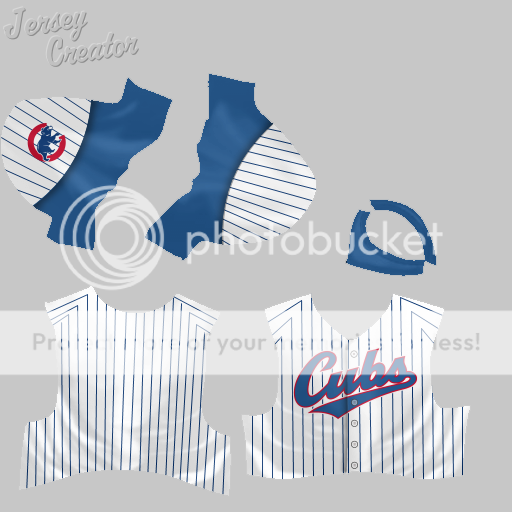 Away:  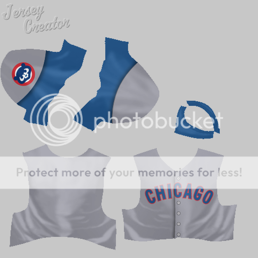 Want a solid-color top? I can do that: 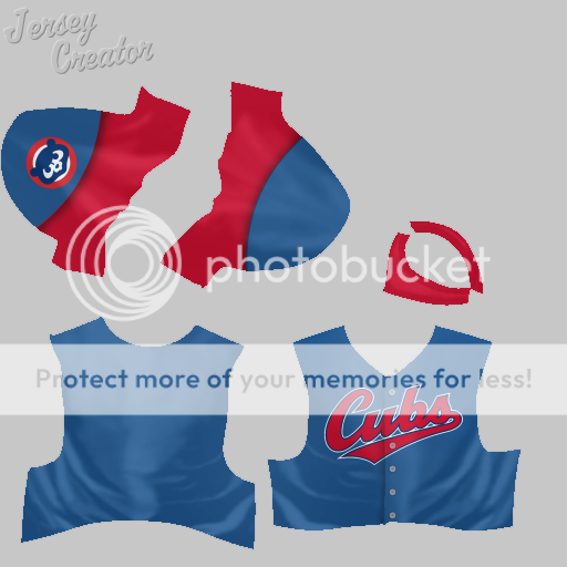
|
|
|
|
|
06-18-2016, 02:29 PM
|
#19 |
|
Minors (Double A)
Join Date: Dec 2015
Posts: 143
|
Oh, and I also have a new version of the Boston Red Sox away jersey with a better wordmark. Here it is:
 Next, let's head to Los Angeles and see what the Dodgers have been up to. |
|
|
|
|
06-23-2016, 09:58 PM
|
#20 |
|
Minors (Double A)
Join Date: Dec 2015
Posts: 143
|
Sorry for the delay, everyone. The Los Angeles Dodgers have decided to embrace a two-tone blue color scheme with white as an accent, similar to the Cincinnati Reds' new uniforms. "Dodger blue" makes its triumphant return. Not everyone was happy with the redesign at first, but it's grown to become iconic of the franchise, not unlike Yankee pinstripes or the Mariner...well, we're getting ahead of ourselves now.
Here they are, the Los Angeles Dodgers c. 2025: Home:  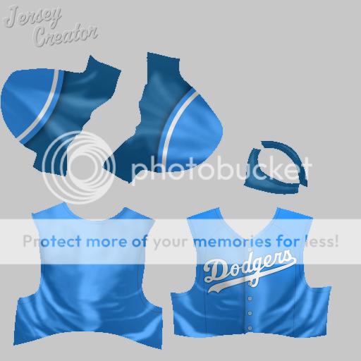 Away:   Want a solid-color cap in Dodger blue? Can do:  It'll be the Angels next up, of course. |
|
|
|
 |
| Bookmarks |
|
|


