 |
 Home | Webstore Home | Webstore
|
|
Latest News:
OOTP 25 Available
- FHM 10 Available
- OOTP Go! Available
Out of the Park Baseball 25 Buy Now! |

|
|
||||
| ||||
|
|
#1 |
|
Minors (Rookie Ball)
Join Date: Jul 2015
Posts: 33
|
Some Jerseys & Logos to Share
So I have been playing OOTP for about a year now, and one of my favorite parts of the game is the jerseys and logos. I owe a big thanks to TXRanger, Knuckler and Justafan and many others for making my league look as good as it does!
Given this, I wanted to share some of my creations as a way of giving back to the community. Here's the link to my Photobucket album. Many of the items in this bucket aren't mine, but I included them for the sake of completeness (that is, if I created a jersey based on someone else's logo, I included the logo, too, so that they're all in one place). Atlanta Jets: The logo is a reworking of Knuckler's Seattle Jets Logo: 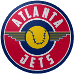 The cap and jerseys follow the same color scheme: 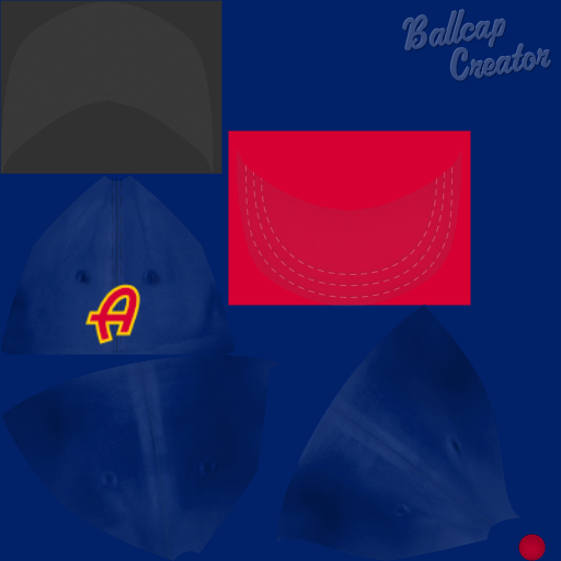 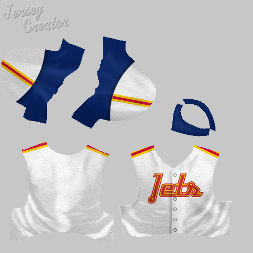 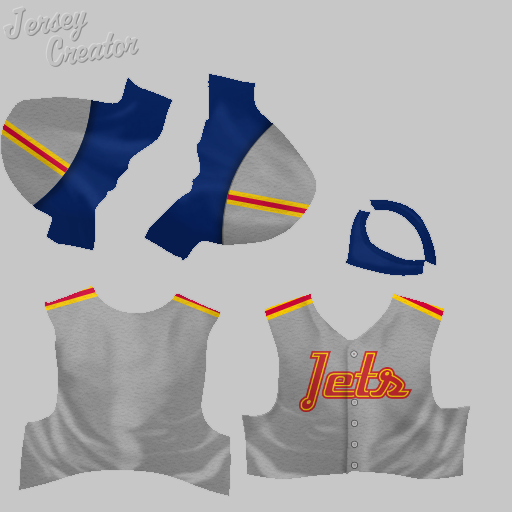 Baltimore Charm: This logo is from a Legends Football League team. Apparently, Baltimore is known as the Charm City, hence the name. I haven't actually used this team in my league yet. 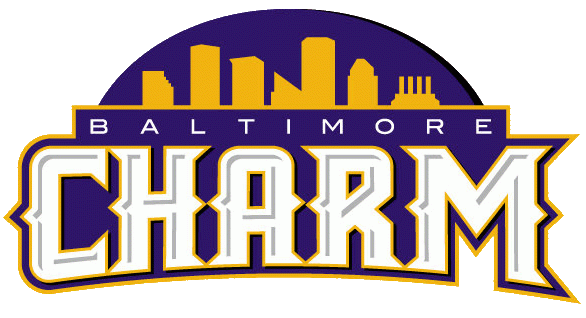 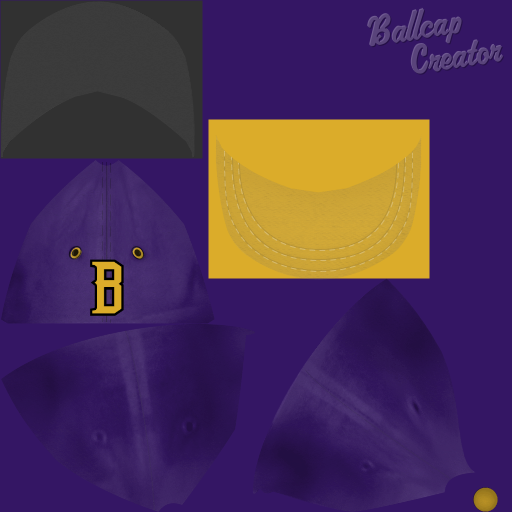 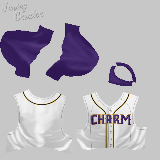 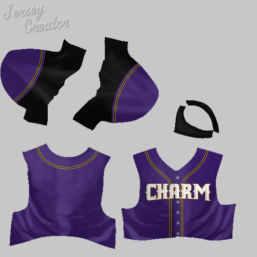  Baltimore Terrapins: This team takes its name from an old Federal League team, and I'm using Knuckler's logo and TXRanger's home jersey from the Retro thread. I made my own alternate jersey and away jersey as my league moved into the modern era: 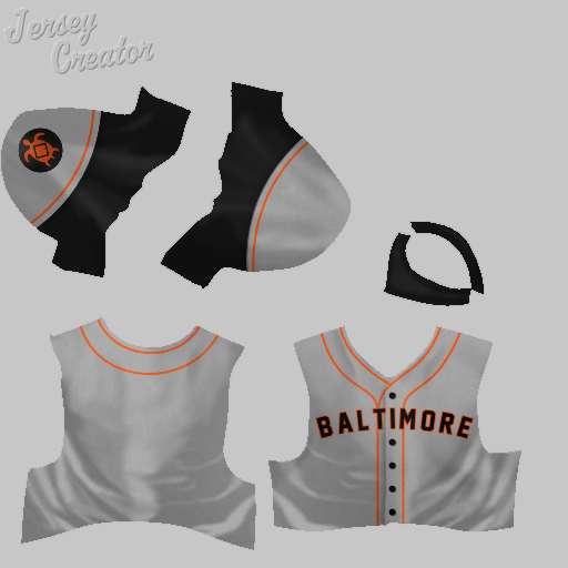 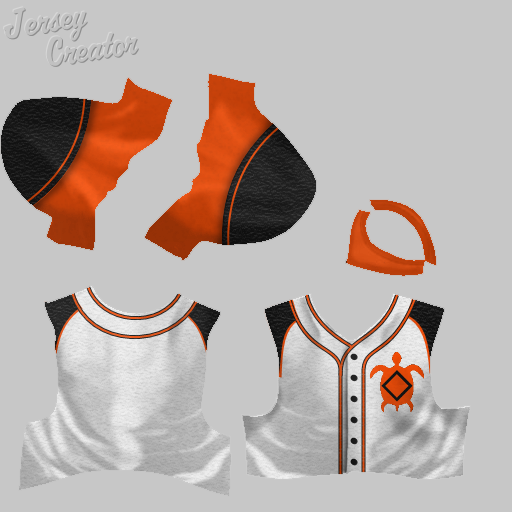 More to come! Last edited by MAmerica1; 06-24-2016 at 09:25 PM. |
|
|

|
|
|
#2 |
|
Minors (Rookie Ball)
Join Date: Jul 2015
Posts: 33
|
Boston Green Sox:
I don't know where this logo came from. It's not mine, but I'm including it here because I can't find it elsewhere. The cap and jersey I made.  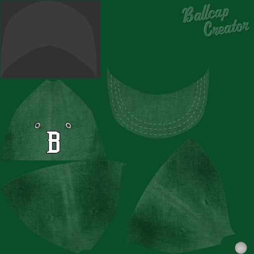 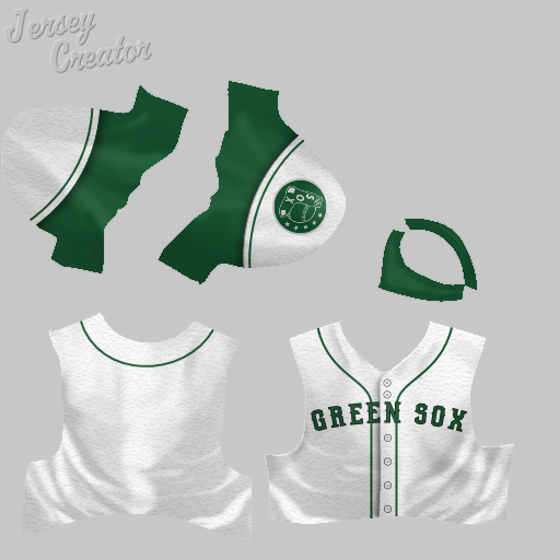 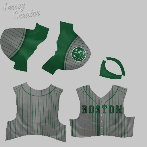 Bronx Lions: The logo is a reworking of Knuckler's St. Louis Lions logo. I'm not as good with fonts, so there's no drop-shadow on "Bronx." The cap and jersey follow the colors of the logo.   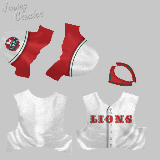 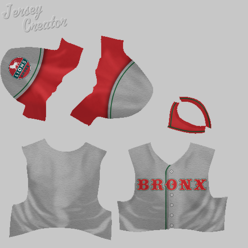 Buffalo Blues: This is another TXRanger jersey and Knuckler logo where I made my own away jersey: 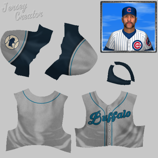
|
|
|

|
|
|
#3 |
|
Minors (Rookie Ball)
Join Date: Jul 2015
Posts: 33
|
Chicago Colts:
Not sure who reworked the Chicago Cubs uniform and logo into the Chicago Colts, but it is a great variant on a classic look. I made my own away jersey:  Chicago Zephyrs: The original uniform and logo from the Retro thread was for the Council Bluffs Zephyrs, which was then reworked into the Chicago Zephyrs. I made an away jersey and cap to go along with the fantastic home jersey and logo: 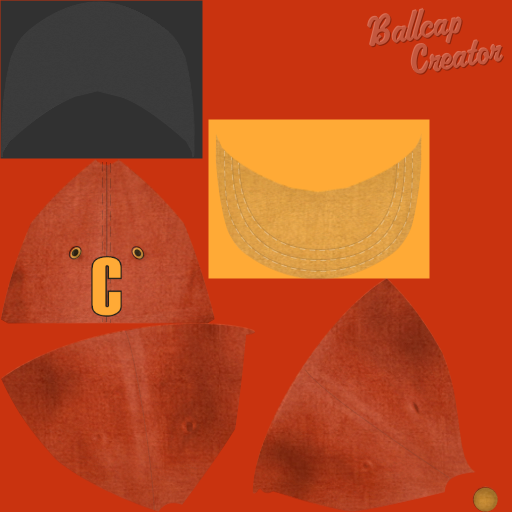  Cleveland Lakers: Knuckler's logo for the Lakers is one of my favorites, and I made my own alternative uniform set to go with it: 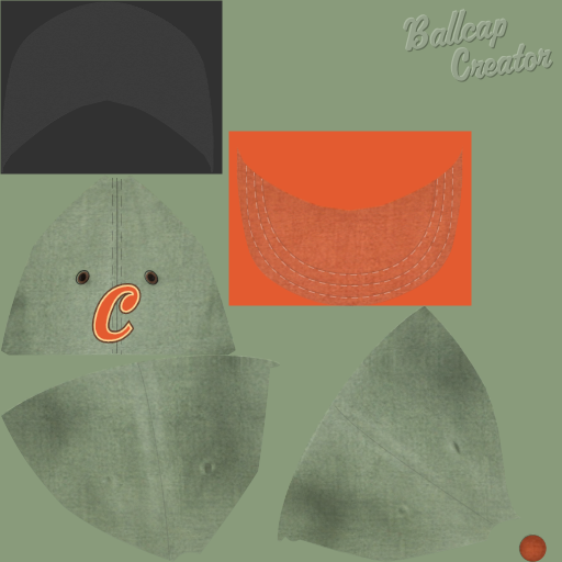 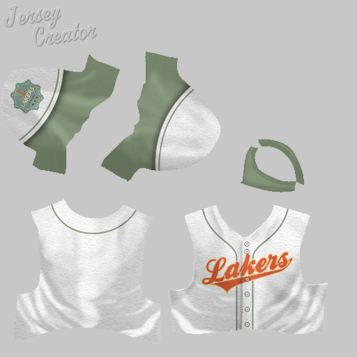 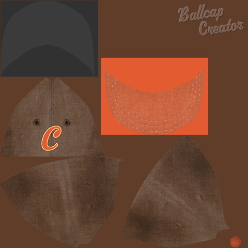 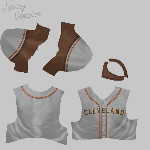 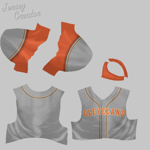
|
|
|

|
|
|
#4 |
|
Minors (Rookie Ball)
Join Date: Jul 2015
Posts: 33
|
Dallas Steers:
A bit more modern take on TXRanger's retro Dallas Steers uniform set: 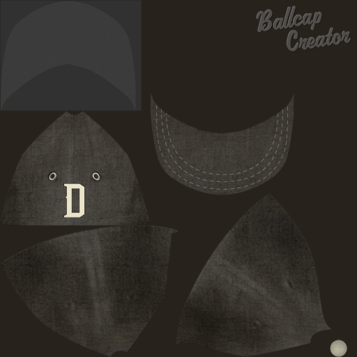 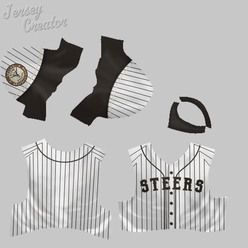  Denver (or Colorado Springs) 14ers: The logo is from a D-league basketball team. I made two versions of the uniform, with different shades of blue and using different logos. (Note that the file names are inconsistent - logo refers to Colorado Springs while the jerseys refer to Denver.) 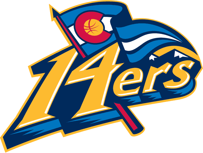 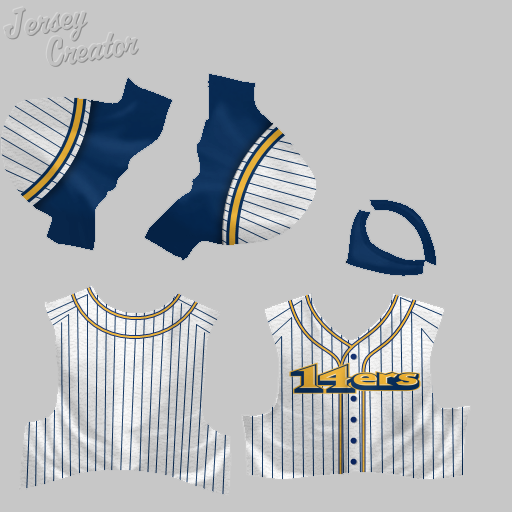 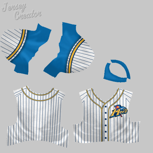
|
|
|

|
|
|
#5 |
|
Minors (Rookie Ball)
Join Date: Jul 2015
Posts: 33
|
Des Moines Demons:
I got the logo from this website: http://www.funwhileitlasted.net/2013...moines-demons/. The jersey and cap are mine. I didn't make an away jersey (I usually don't for my minor league teams). 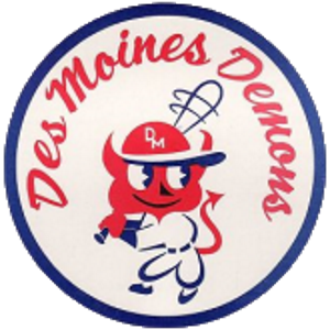 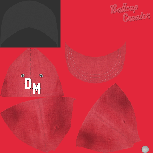 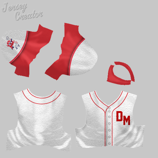 Fort Wayne Kekiongas: Another awesome retro logo and uniform set by TXRanger that I reworked into something a bit more modern: 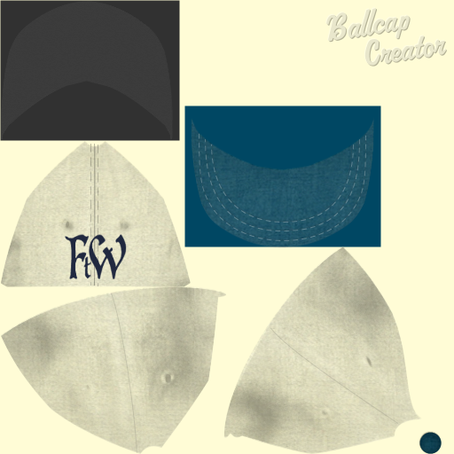  Gary Steel: I reworked Terminal's Pittsburgh Steel logo into Gary Steel, and added a "G" cap to go along with TXRanger's jersey: 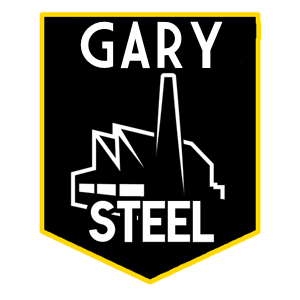 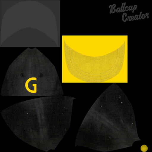 Lakeland Flying Tigers: The logo image comes from the minor league team of the same name. I made the logo, cap and jersey. Again, no away jersey.  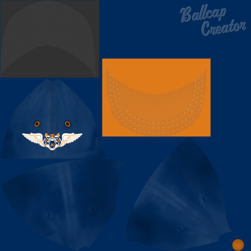 
|
|
|

|
|
|
#6 |
|
Minors (Rookie Ball)
Join Date: Jul 2015
Posts: 33
|
Milwaukee 48ers:
This team is an original of mine. The name is a reference to Milwaukee's German heritage and the large number of immigrants who arrived after the Revolutions of 1848. I got the logo from this website, which actually includes a discussion about why 48ers is a bad name (I disagree, obviously). The gear shape reflects Milwaukee's industrial heritage. I recolored the white in the original black, white and yellow logo to red so that it matches the German flag. The jersey and cap colors follow. 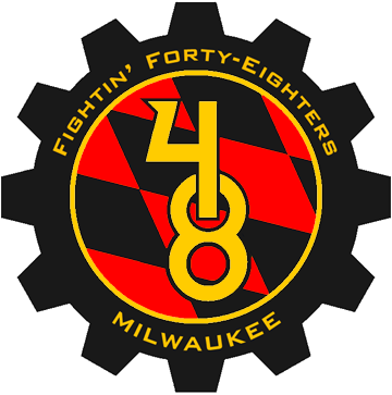 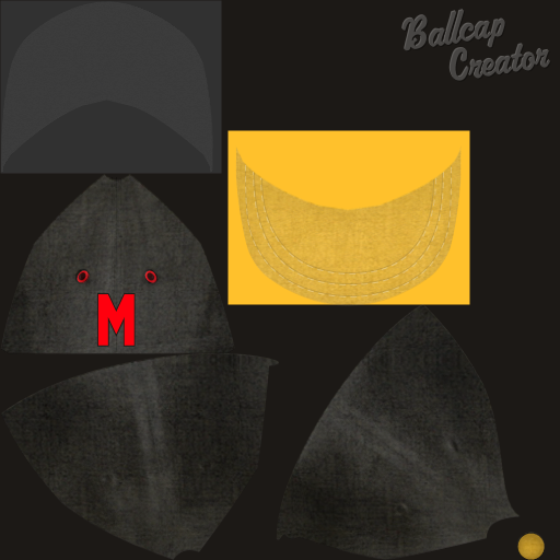 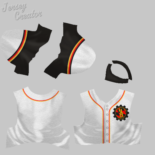 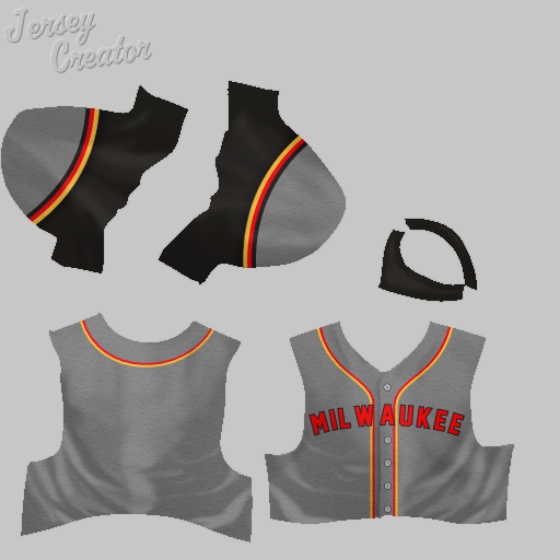
|
|
|

|
|
|
#7 |
|
Minors (Rookie Ball)
Join Date: Jul 2015
Posts: 33
|
Mississauga Golden Horseshoes:
An original of mine. Mississauga is a large city in the Greater Toronto area, which is part of a larger region called the Golden Horseshoe, hence the team name. The logo is a gold version of the Indianapolis Colts' logo, with a block M added. 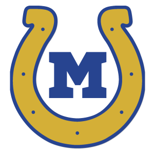 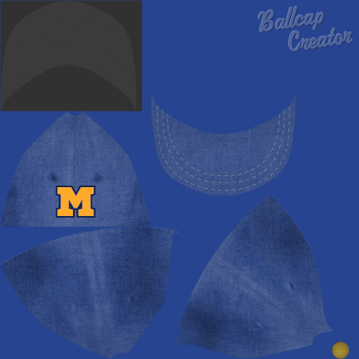 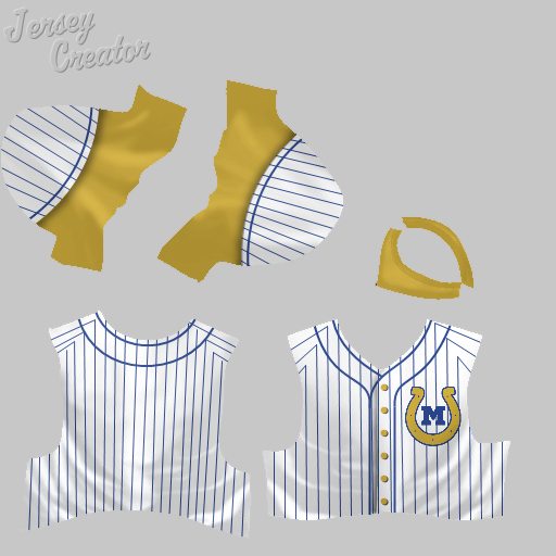 Montreal Maroons: The name comes from the old hockey team of the same name. The logo, which I used on the cap, is by Righty Groove. I used TXRanger's Washington Maroons home jersey and then made my own away jersey. 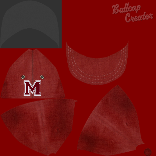 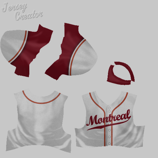 Nashville Agrarians: Another original of mine. The name comes from a group of writers based at Nashville's Vanderbilt University in the 1930s. The logo is pretty bad, evidence of my limited artistic ability. I'll probably try to find or make something better at some point.  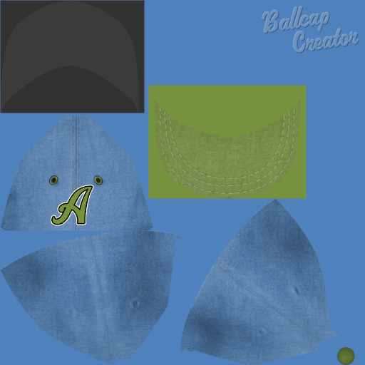 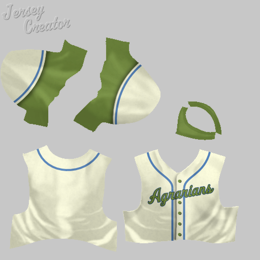 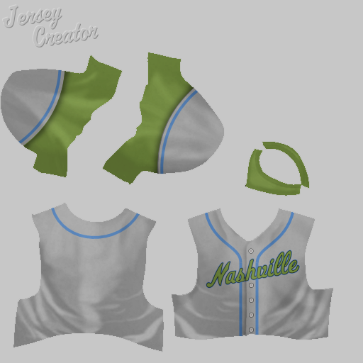
|
|
|

|
|
|
#9 |
|
Minors (Rookie Ball)
Join Date: Jul 2015
Posts: 33
|
New York Gothams:
I know there are a bunch of different uniforms for the Gothams floating around. I can't remember why I made my own - maybe I just couldn't find some at the time. Anyway, for the home jersey, I went with a Gothic "G" on the chest, which seemed appropriate given the team name. Originally, I went with orange undershirts, but eventually I decided these were too garish and I changed them to black. Both versions are below. 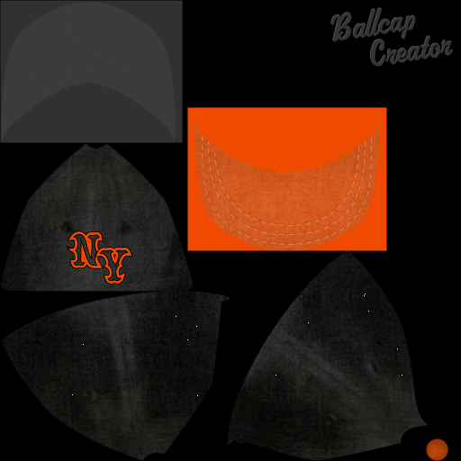 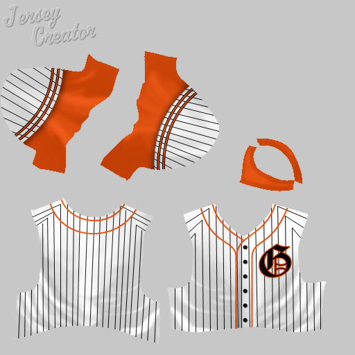 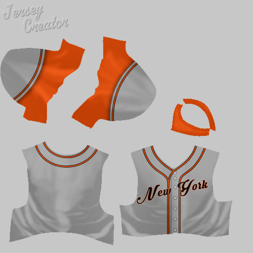 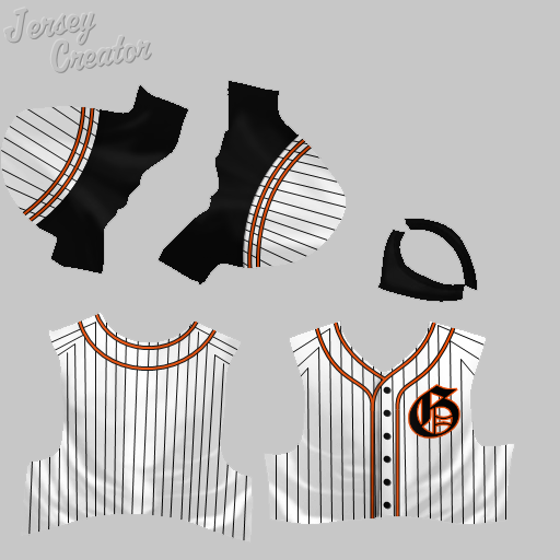  Oakland Diablos: An original of mine. The name references Mt. Diablo, which is near Oakland, though it was actually chosen originally because my son thought Oakland Oaks was lame. Our favorite team is the Oakland A's, so I wanted the Diablos to be great, but in my league they were the worst expansion team ever - they set the record for most losses in a season and never came close to making the playoffs. I eventually disbanded them. Anyway, in the midst of all the futility, I kept changing their jerseys in hopes of improving their luck. The logo comes from a Mexican soccer team, but I can't find the original. The word mark comes from the Diablos Rojos de Mexico baseball team.  Here's the primary uniform set:  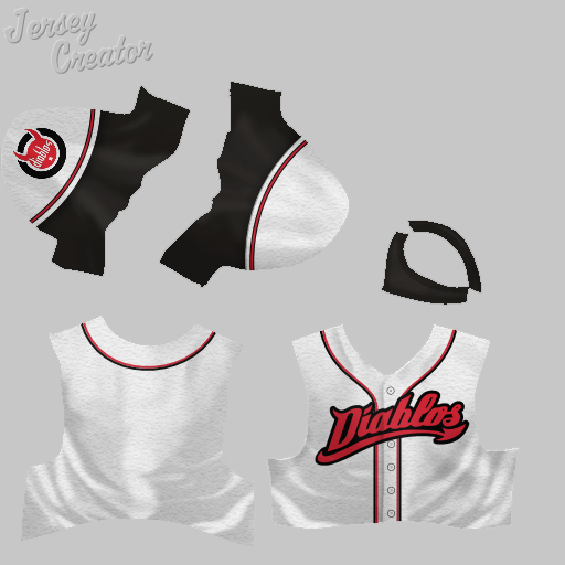 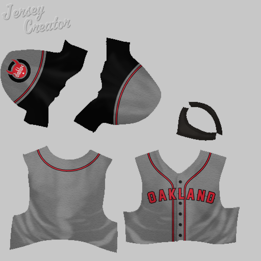 Here's a black alternate home uniform: 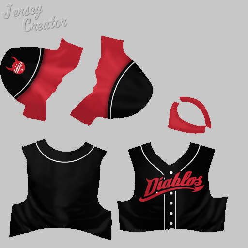 Here's another alternate, with a different cap: 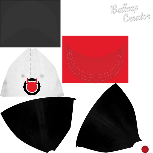 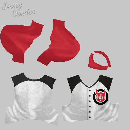 Here's the 1980s White Sox-style crazy lettering alternate, with two versions each of the hat and jersey: 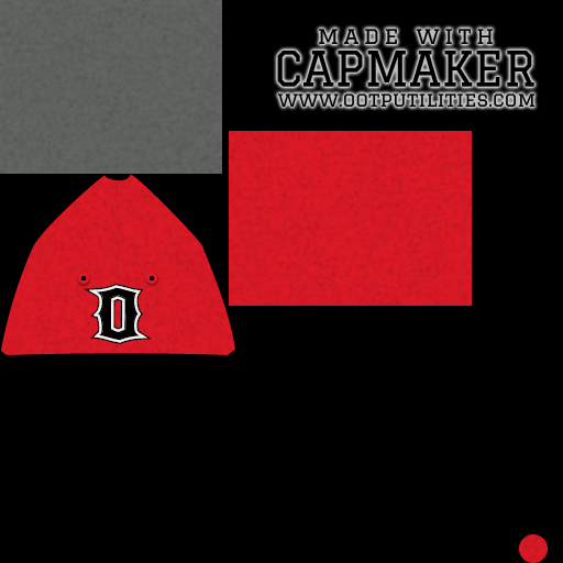  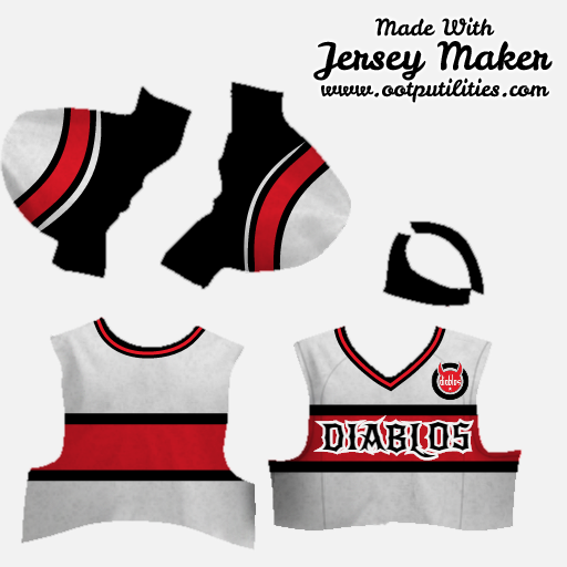 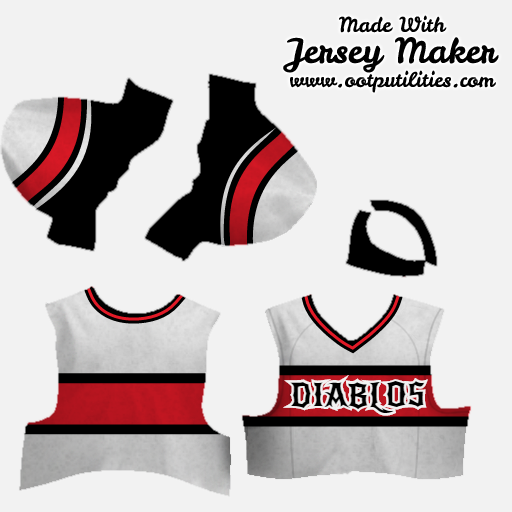 Orlando Sentinels: An original of mine. The name comes from the fact that the city of Orlando was supposedly named for a soldier who was killed while serving as a sentinel (guard). After I came up with that, I realized that the local paper is called the Orlando Sentinel, which is why the name had a familiar ring to it. The shade of blue is taken from the paper's logo. I haven't made a logo for the team yet.  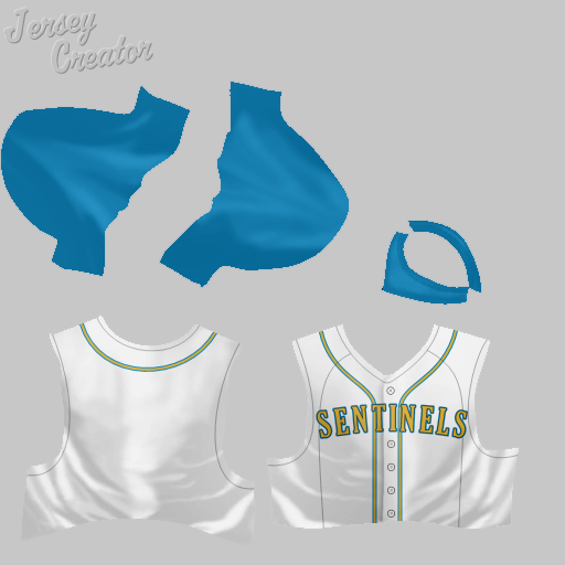 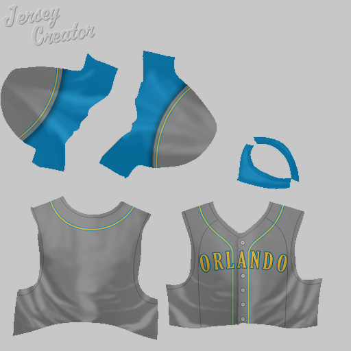
|
|
|

|
|
|
#10 |
|
Minors (Rookie Ball)
Join Date: Jul 2015
Posts: 33
|
Oxnard Strawberries:
An original of mine, intended as a minor league team. Named for the main crop grown in Oxnard. 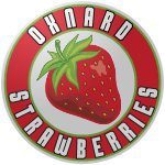 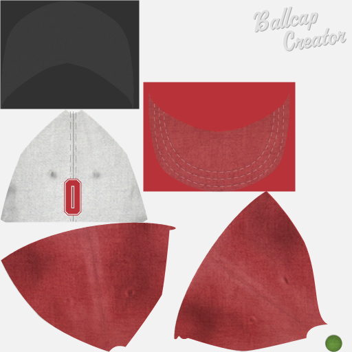 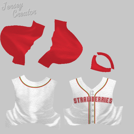 Pasadena Roses: An original. In my league, this is a third LA-area team (along with the LA Blue Sox and Hollywood Stars). The logo is based on the Tournament of Roses Parade logo. This set has a home alternate that I just made the other day.  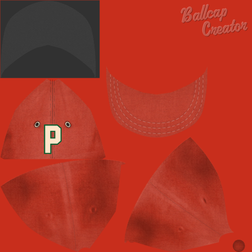 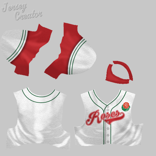 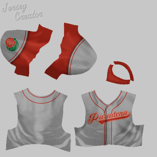 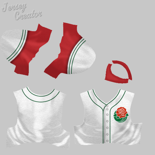 Philadelphia Quakers: A more modern version of the Quakers jersey and cap, based on the red and cream version of Knuckler's great logo. This was one of the first jerseys I did, and looking back I probably could have done a better job incorporating the cream color into the jersey. Perhaps I'll revisit. 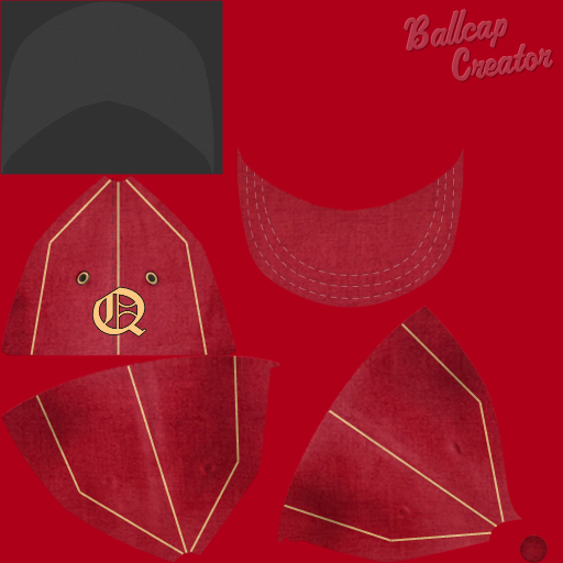 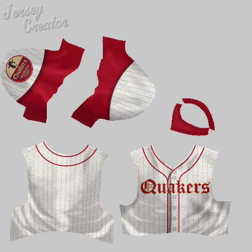 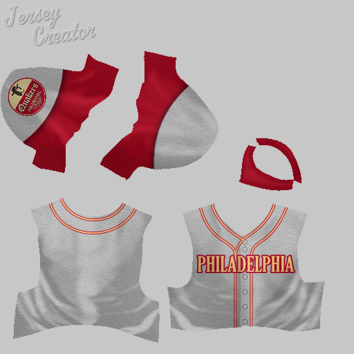 Pittsburgh Arsenal: So when I was coming up with my league, I went back and forth on names for a while. Steelers is really a pretty perfect name for the city, and the logo is an all-time great, but I wanted to avoid existing MLB and NFL names as much as possible. So I read up on the history of Pittsburgh and found out the it was the location of a famous arsenal. Combine this with the fact that Arsenal is my favorite Premier League team name, and I was quite pleased with myself for coming up with such a unique name. Of course, it turned out that I was far from the first to think of it. And lo and behold, Knuckler had created an excellent logo for the team. TXRanger had made great solid-color jerseys, too. But I decided to make my own jerseys, since I tend to prefer traditional white and gray. (I did make a solid black alternate, but I've never used it.) 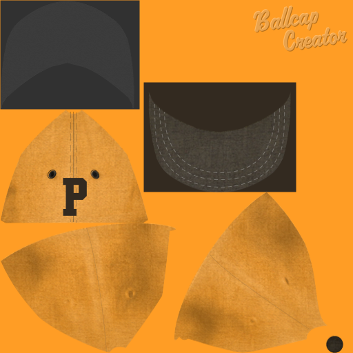 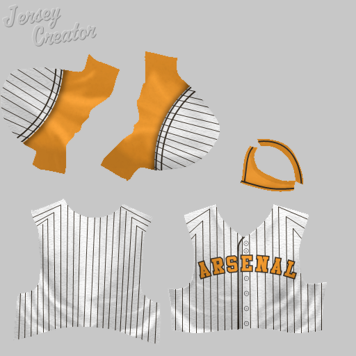 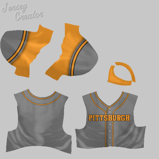 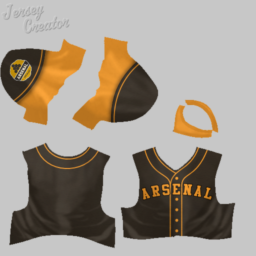
|
|
|

|
|
|
#11 |
|
Minors (Rookie Ball)
Join Date: Jul 2015
Posts: 33
|
Queensboro Coronas:
In my league, I eventually had 4 NY-based teams, one for each of the boroughs (excluding Staten Island). For Queens, the plural borough name gave it an odd sound, so for the team name I went with Queensboro instead (like the bridge), though the away jersey just reads "Queens." Corona, meanwhile, is Latin for crown, which fits with Queens, and also Shea Stadium was located in Flushing Meadows-Corona Park. The logo, meanwhile, takes the crown symbol from Corona beer, and the logo, cap and jersey all feature Gothic lettering similar to the beer brand. The uniform set includes a purple alternate jersey: 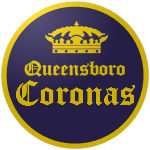 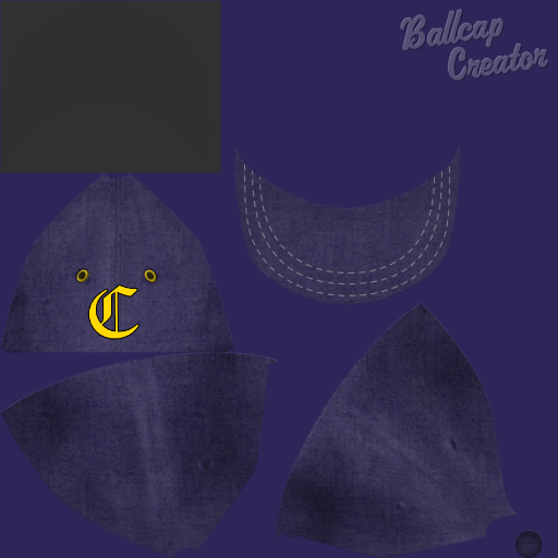 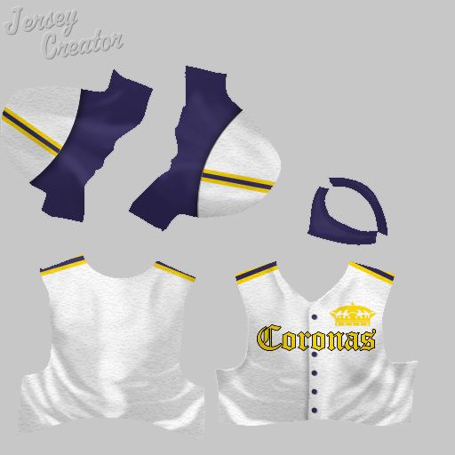 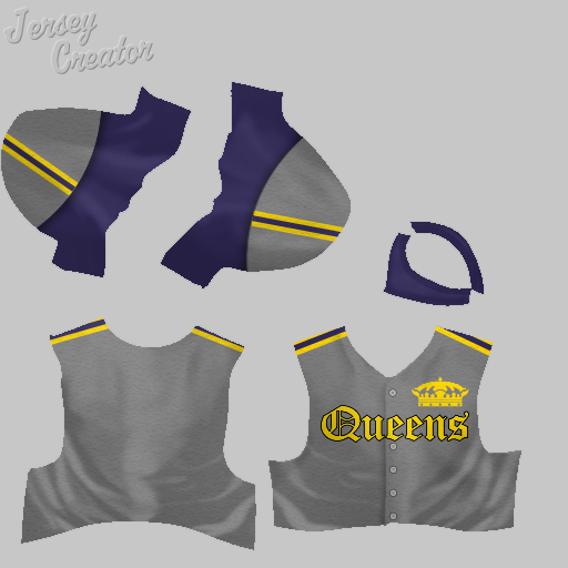 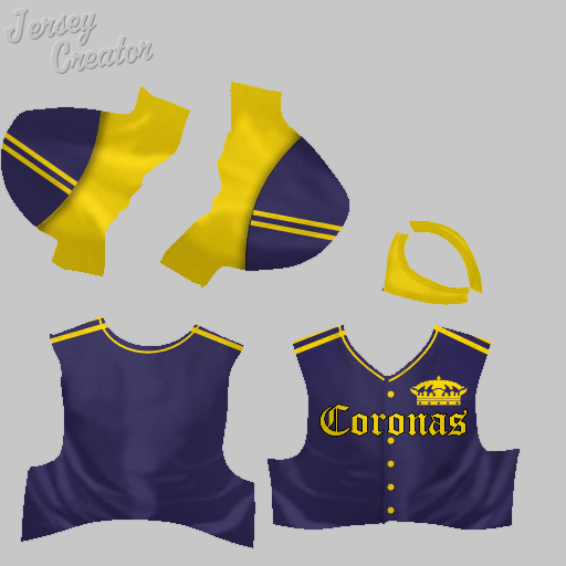 Sacramento Goldpanners: An original of mine. The logo is taken from the Alaska Goldpanners, and the team colors are similar to those of the San Francisco 49ers, though with a deeper shade of red. 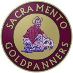 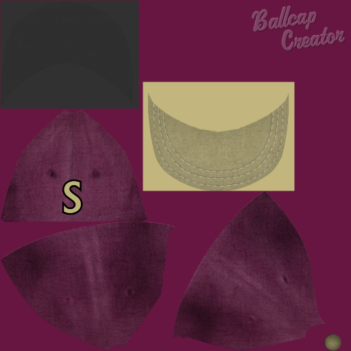 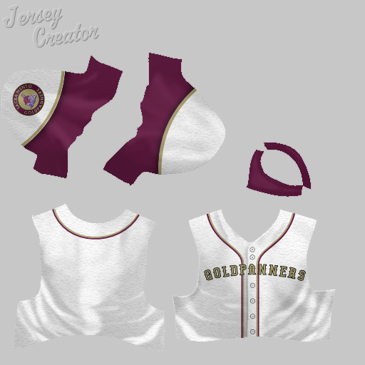 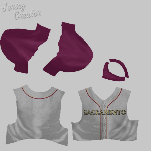 Sacramento Gold Sox: Another original Gold-themed Sacramento team, though of course there are other Gold Sox out there. I haven't made a logo for this one yet, as I haven't used it in-game. 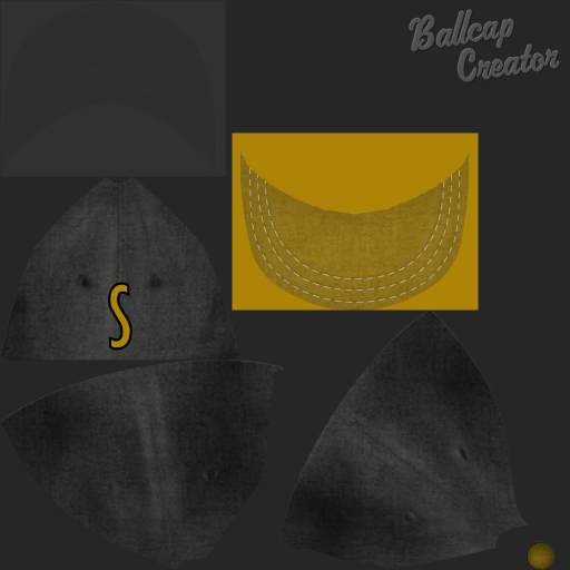 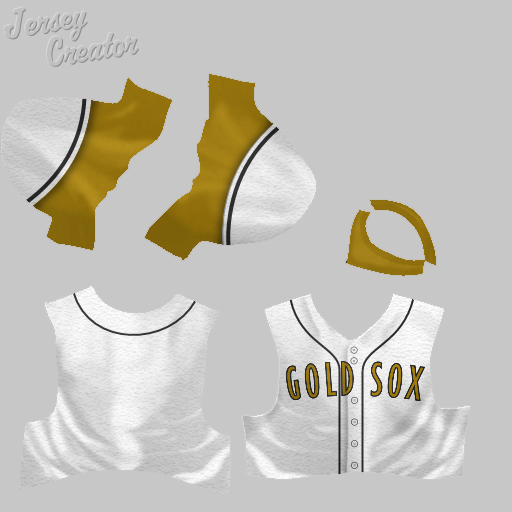 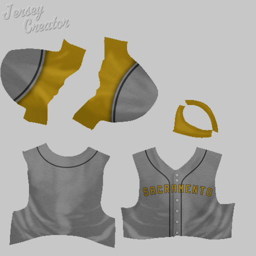 San Diego Sailors: Another set that I made based off an excellent Knuckler logo. I'm quite fond of the font on these though the letter spacing is a bit off on the home jersey. 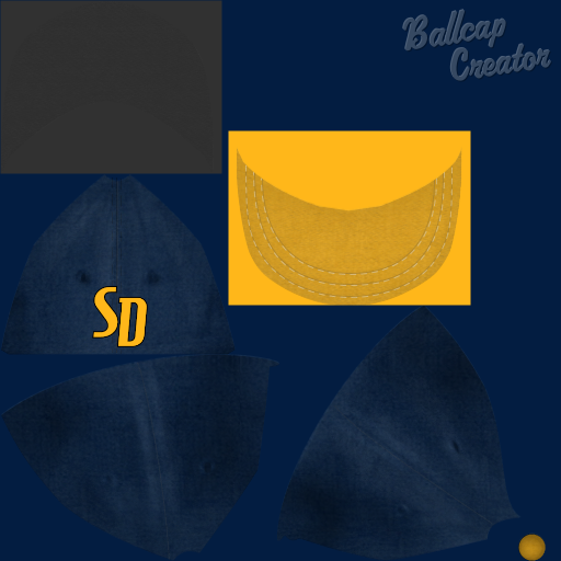 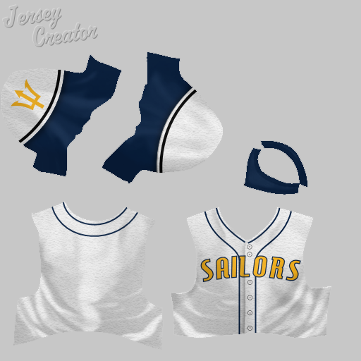 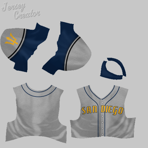
|
|
|

|
|
|
#12 |
|
Minors (Rookie Ball)
Join Date: Jul 2015
Posts: 33
|
San Francisco Ocelots:
This was my first original team. My sons came up with the name and team colors. I lifted the logo from a music group called Ocelot. Since this was my first attempt, there are a bunch of variants. Also, some of the files are labelled San Francisco Ocelots, and some just Ocelots, just like some of the uniforms and caps lack a SF logo, so these could easily be used for other cities. Original Red & Yellow Set, with SF logos: 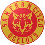 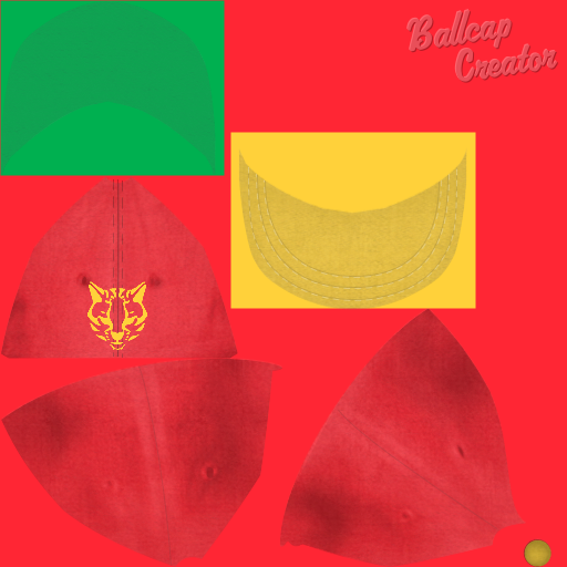 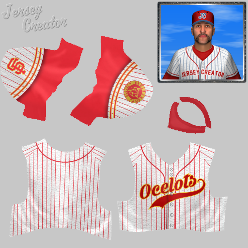 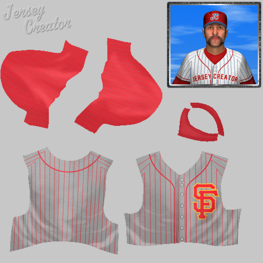 Blue & Black Logo & Cap, with SF references: 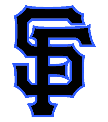 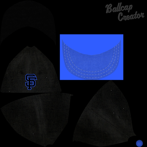 Blue & Black Alternate Set, with no city references:  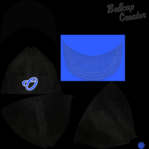 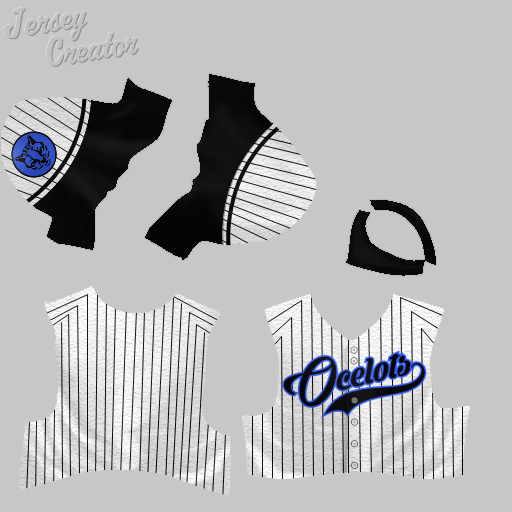 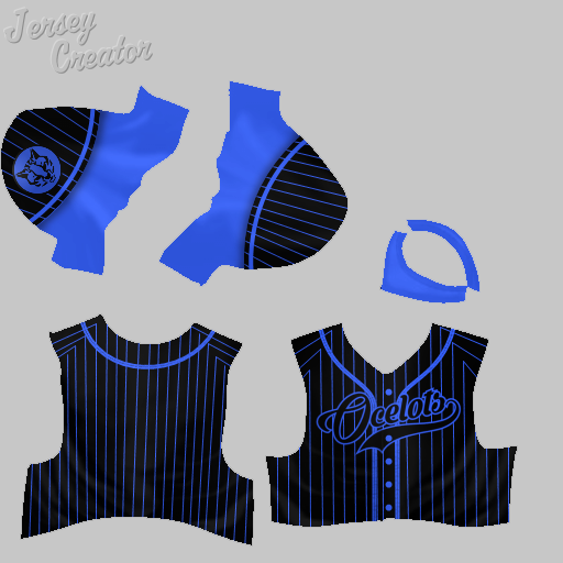 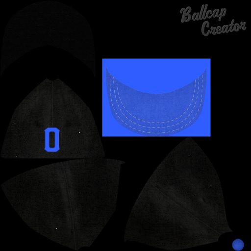 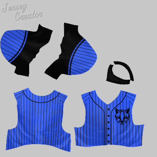
|
|
|

|
|
|
#13 |
|
Minors (Rookie Ball)
Join Date: Jul 2015
Posts: 33
|
San Francisco Pacifics:
This logo is a variant of the San Francisco Giants, with different colors. The original uniform set had white caps for home and gray for away, but I later changed this to a blue cap, which looks better. There are a couple alternate jerseys. 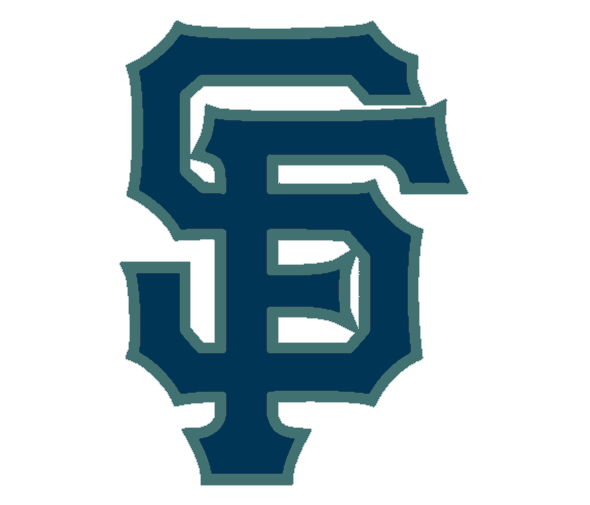 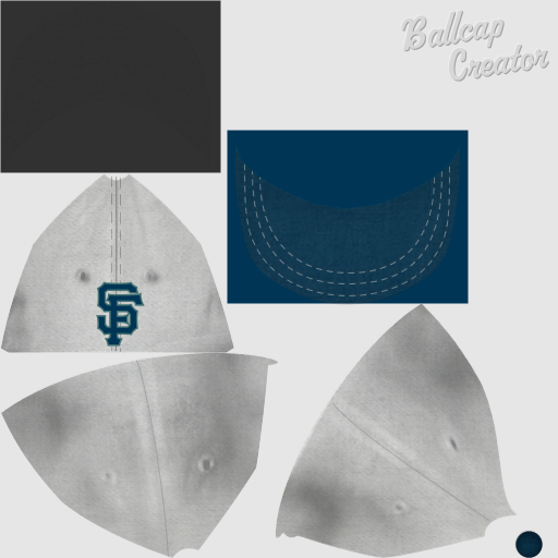 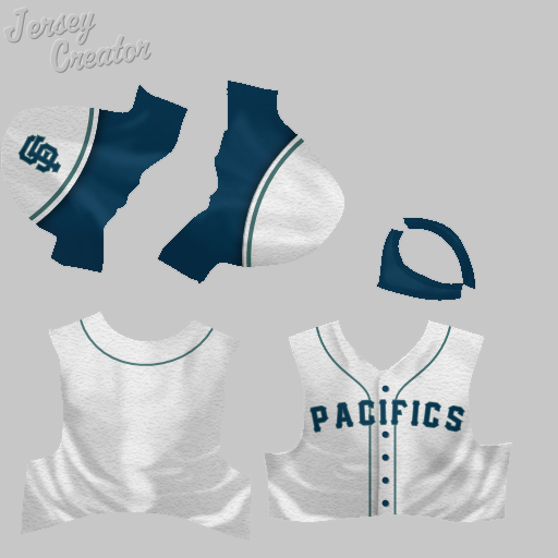 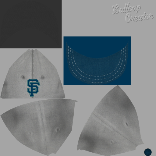 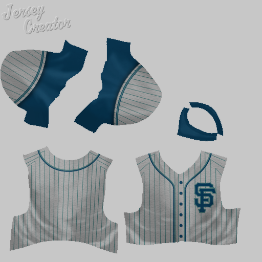 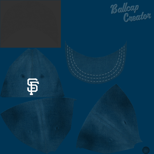 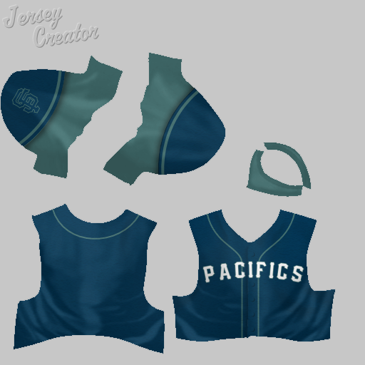 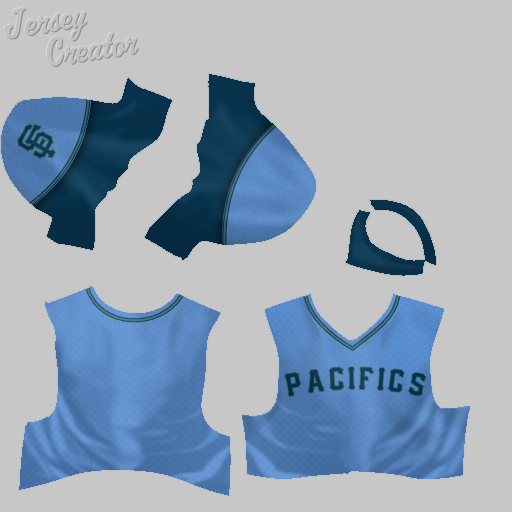 Saskatoon Berrypickers: An original of mine. The team is named for the berries which give Saskatoon its name. I got the logo image from the Saskatoon Berry Institute. I made several versions of this uniform, with slightly different colors and fonts: Primary uniform (burgundy):  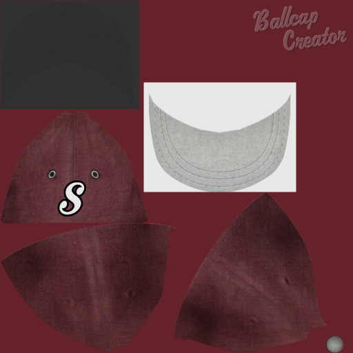 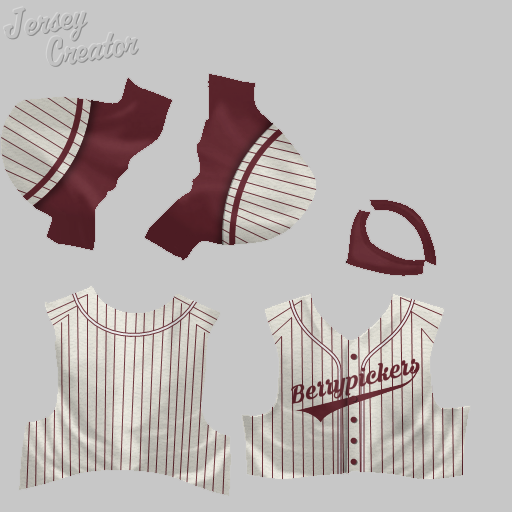 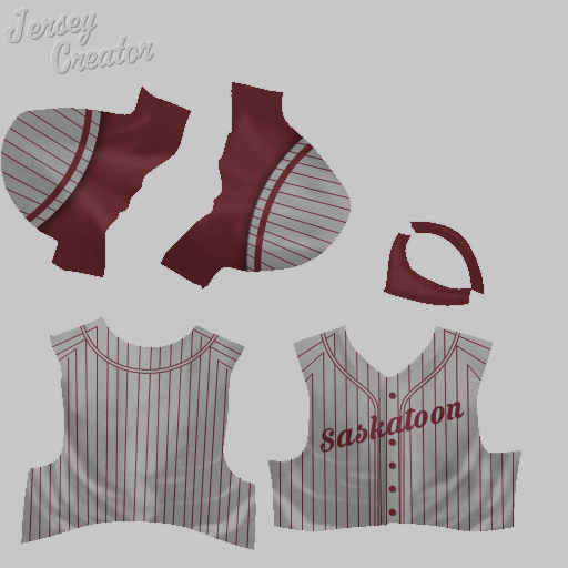 Variant (purple): 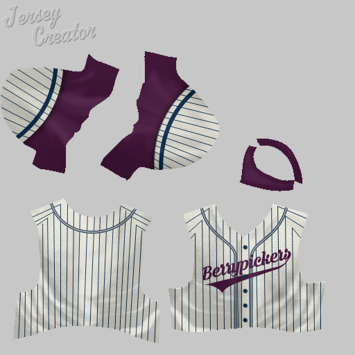 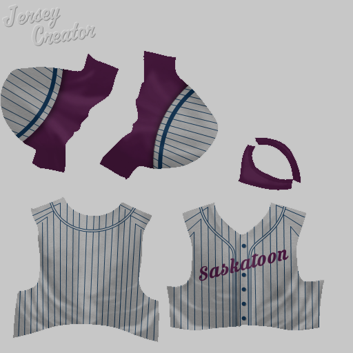 Variant 2 (different font): 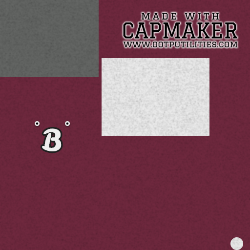 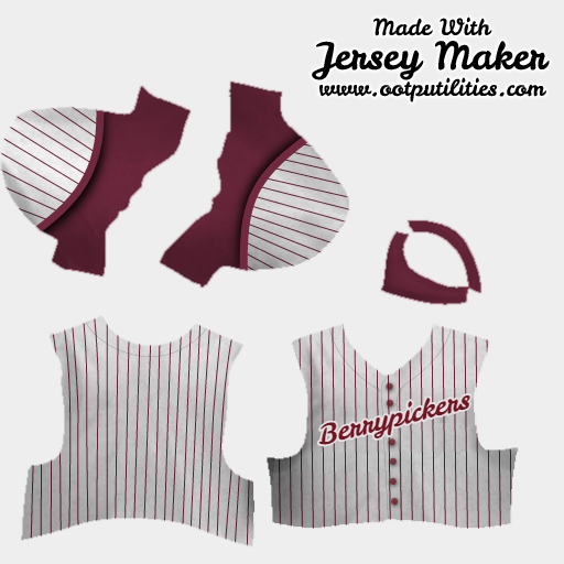 Spokane Bunchgrassers: This was the name of a real team real team from the 1890s. The name comes from the type of grass that grows in arid Eastern Washington. I picked the team colors to be evocative of the evening sky and golden grass. 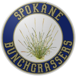 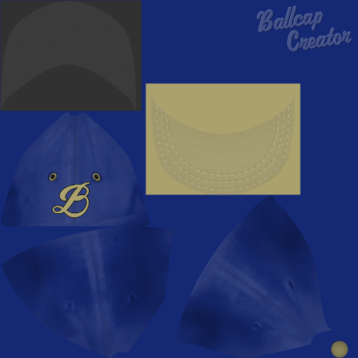 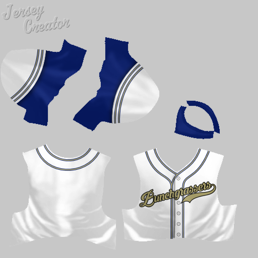
Last edited by MAmerica1; 06-29-2016 at 05:19 PM. |
|
|

|
|
|
#14 |
|
Hall Of Famer
Join Date: May 2009
Posts: 2,430
|
All the people who complain about the Montgomery Biscuits and Lansing Lugnuts of the world, what they don't realise is that minor league teams have a LONG tradition of "out-there" nicknames.
I can honestly say that Spokane Bunchgrassers is the weirdest one I've ever heard.
__________________
Mainline team  SPTT team  Was not a Snag fan...until I saw the fallout once he was gone and realized what a good job he was actually doing. - Ty Cobb |
|
|

|
|
|
#15 | |
|
All Star Starter
Join Date: Sep 2015
Location: Kelowna, British Columbia
Posts: 1,266
|
Quote:
|
|
|
|

|
|
|
#16 |
|
Minors (Rookie Ball)
Join Date: Jul 2015
Posts: 33
|
St. Louis Terriers
This is a more modern version of TXRanger's Terriers set, utilizing the same color scheme, which is one of my favorites. 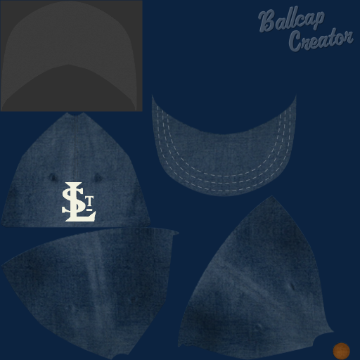 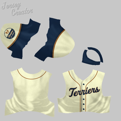 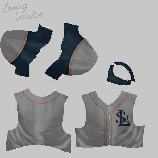 Tampa Hammerheads: An original of mine, made possible by borrowing an excellent logo and word mark from here.  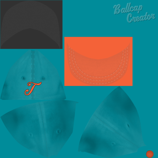 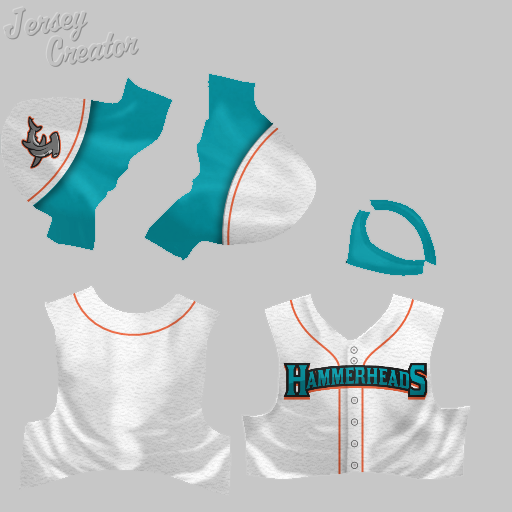  I also did a variant for Miami (using a cap logo I found in a post by karmco): 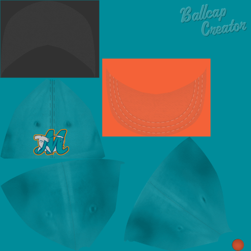 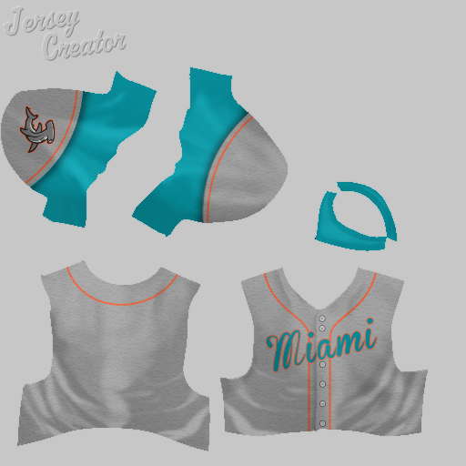 Toronto Argonauts: I created an alternate away jersey to go with the existing set by Pwal. 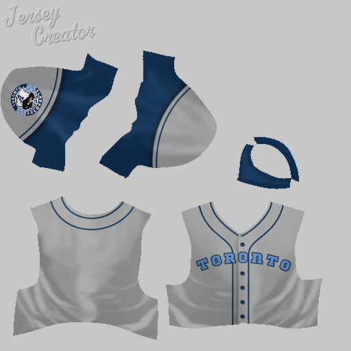 And that's it for my jerseys so far. I hope some folks found this helpful. If you look through my Photobucket, there are a few other variant logos or word marks that I didn't include, plus the matching pieces to sets that I added to. If there anything you're looking for and can't find, let me know. |
|
|

|
|
|
#17 | |
|
Minors (Rookie Ball)
Join Date: Jul 2015
Posts: 33
|
Quote:
Also, I hadn't realized (or had forgotten) that TXRanger and Knuckler already did a Bunchgrassers uniform and logo, in an 1890s style. |
|
|
|

|
|
|
#18 |
|
Minors (Rookie Ball)
Join Date: Jul 2015
Posts: 33
|
So recently, I discovered that there are a number of excellent jersey & logo concepts out there which, thanks to Justafan's programs, can be pretty easily turned into OOTP jerseys, caps and logos.
With all of these, I have tried to stick to the original design, as best I could. However, I've included a bunch of the various elements (logos, wordmarks, etc.) in my Photobucket folder, so that if anyone else wants to play around with the designs, they can. Portland Pioneers I posted one of these already, the Portland Pioneers, over in the Retro thread, but I'm including it here, as well, with some modifications. The design is by a Portland-based graphic designer named Sean Bucknam. I found it here and here. Concept 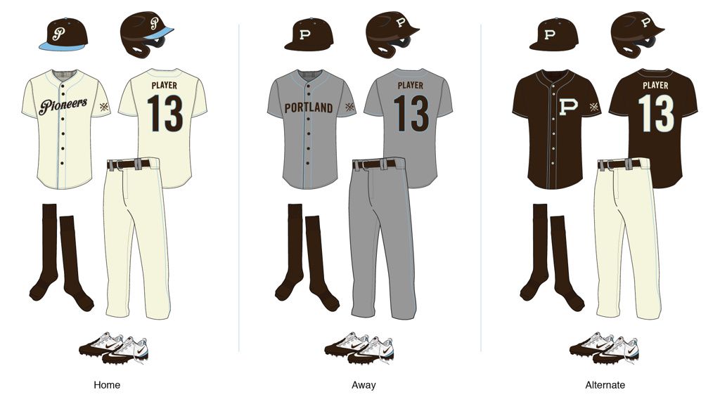 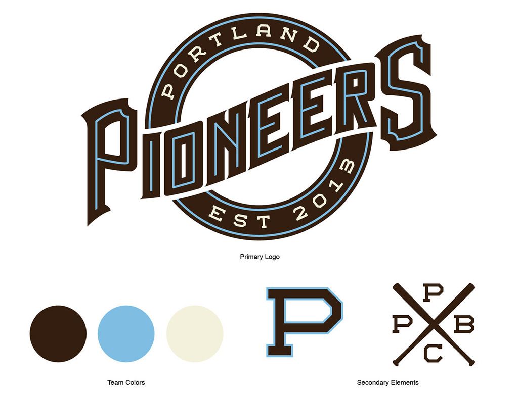 Main Logo  Small Logo  Home Cap  Home Jersey 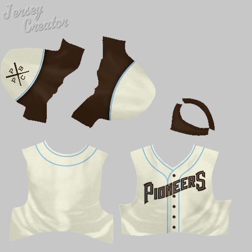 Home Cap - Version 2 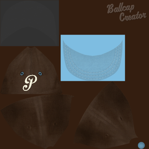 Home Jersey - Version 2  Away Cap 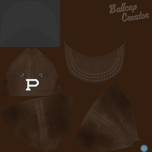 Away Jersey: 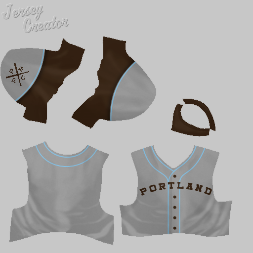 Alt Jersey: 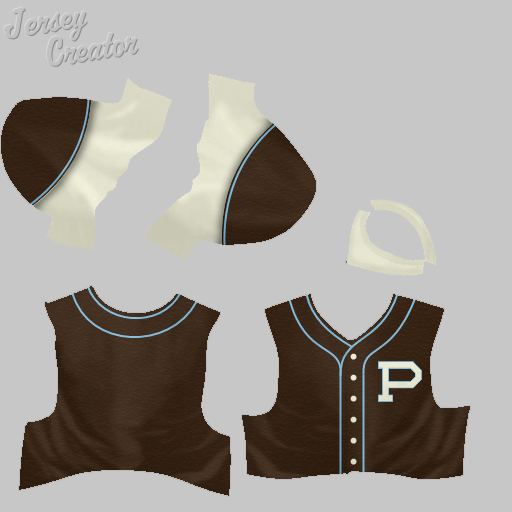 These next two are by Greg Seher, who submitted a bunch of excellent concepts to Uni-Watch last year: Indianapolis Blues Concept 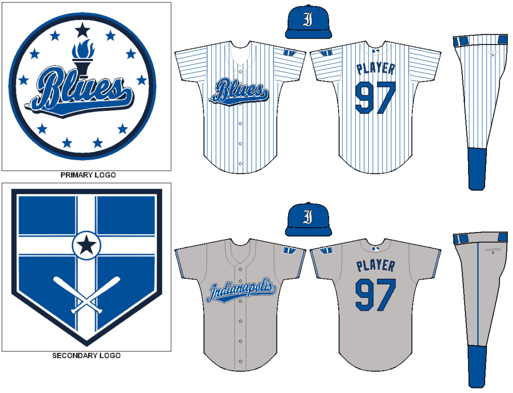 Logo  Ballcap 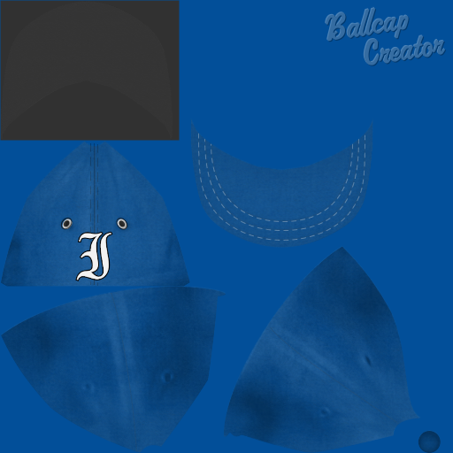 Home Jersey 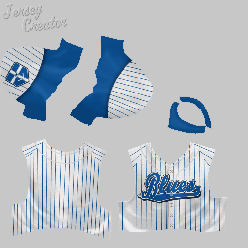 Away Jersey 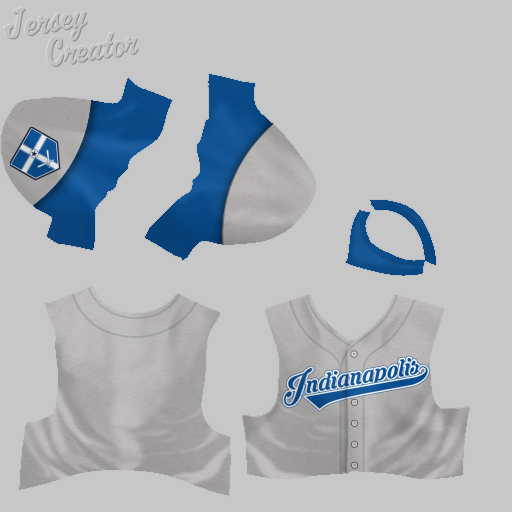 San Antonio Chaparrals Concept 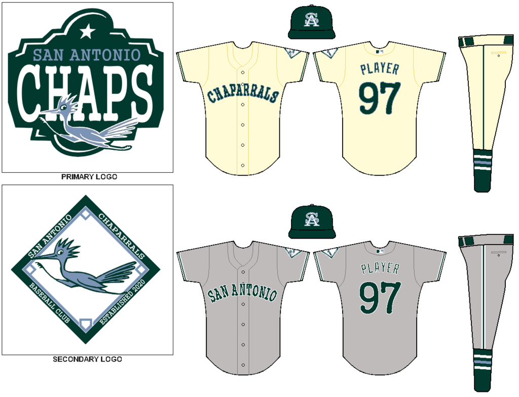 Logo  Ballcap  Home Jersey 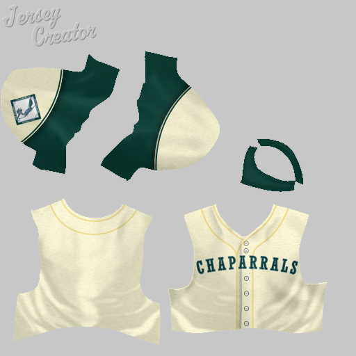 Away Jersey 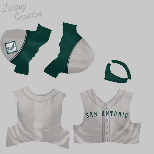
Last edited by MAmerica1; 10-21-2016 at 01:18 AM. |
|
|

|
|
|
#19 | |
|
All Star Reserve
Join Date: Dec 2012
Posts: 576
|
Quote:
|
|
|
|

|
|
|
#20 |
|
Minors (Rookie Ball)
Join Date: Jul 2015
Posts: 33
|
This next batch of uniforms come from designs submitted to Uni-Watch as part of their contest to redesign the Tampa Bay Rays' uniform if the team were to move.
Havana Cubanos (a/k/a Cubanos de la Habana) - Design by Sven Marconi A lot of choices here in terms of colors - I'm partial to the maroon and white alt, even though the logo didn't come out as well as I hoped when I recolored it. Note that the away jerseys use the Spanish spelling of Havana. Concept 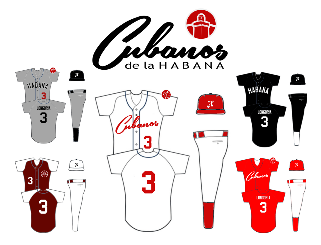 Logo  Small Logo (it's white, so it's hard to see, but it shows up fine in-game)  Home Cap 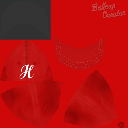 Home Jersey 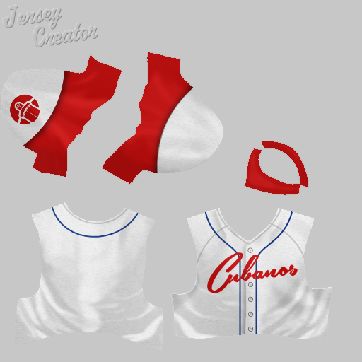 Home Jersey 2 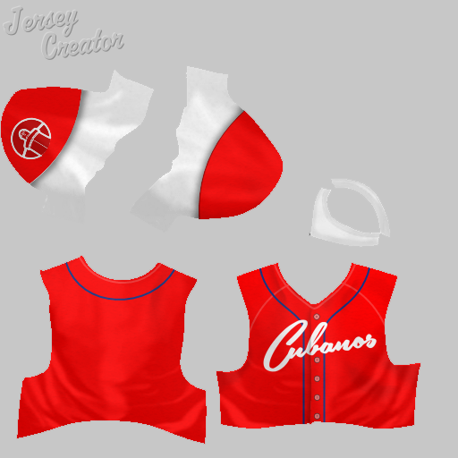 Away Cap 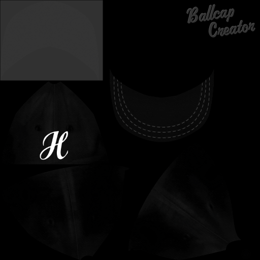 Away Jersey 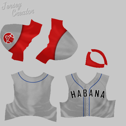 Away Jersey 2 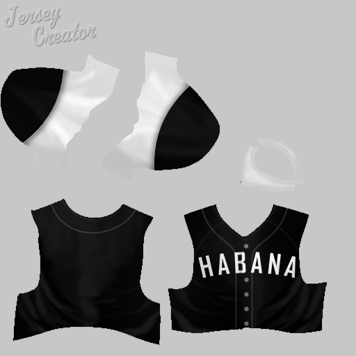 Alt Cap 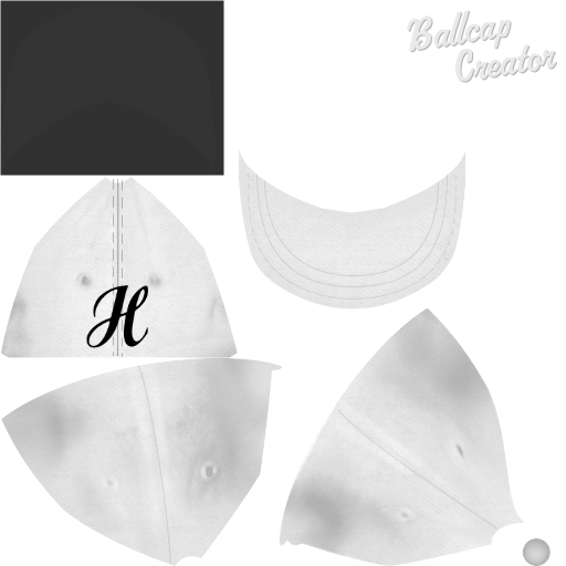 Alt Jersey 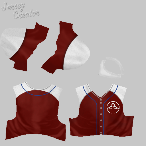 Havana Perfectos - Design by Kevin Callahan The logo on this one is great, in my opinion. Concept 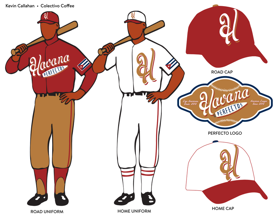 Logo 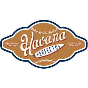 Small Logo  Home Cap 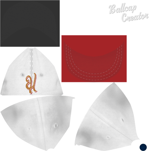 Home Jersey 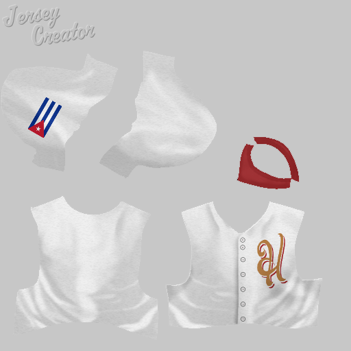 Away Cap 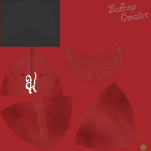 Away Jersey 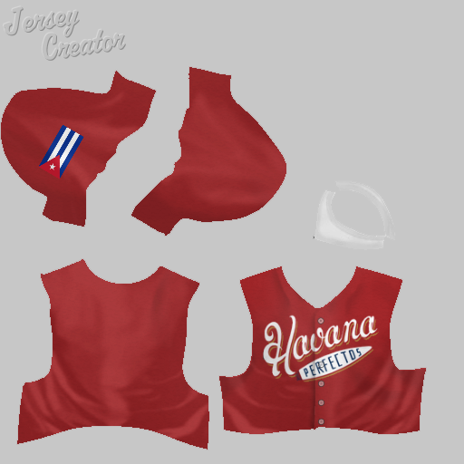 Memphis Rivermen - Design by Brent Hatfield I've wanted to name a team the Rivermen for a while, but I didn't quite love any of the available jerseys out there. This one is pretty good - classic-looking, with a nice logo. Concept 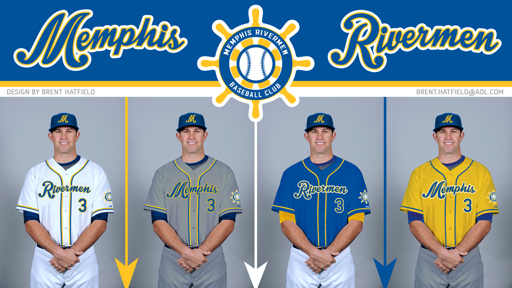 Logo 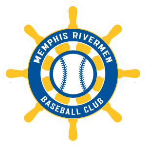 Small Logo  Cap  Home Jersey 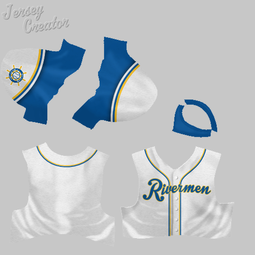 Home Alt Jersey 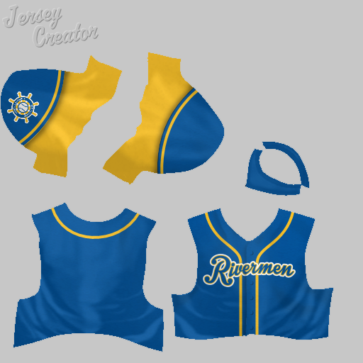 Away Jersey 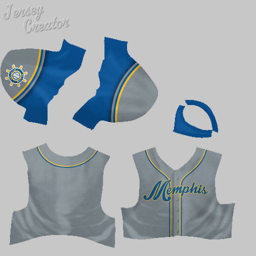 Away Alt Jersey 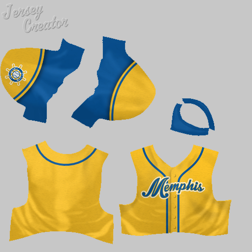
Last edited by MAmerica1; 10-21-2016 at 10:08 PM. |
|
|

|
 |
| Bookmarks |
|
|